


")


")


Want to visualize the mean and standard deviation lines on a column chart in Google Sheets? This guide walks you through exactly how to do that using formulas and a Combo chart—step by step.
Whether you’re analyzing dog heights, student test scores, or any dataset with variation, this method will help you identify outliers and understand spread at a glance.
What This Tutorial Covers
- Adding standard deviation bars using built-in chart options
- A better method: creating a Combo chart with mean and ±SD lines
- Step-by-step formulas and chart settings
- Practical use case and visuals
- Bonus: Related charting resources
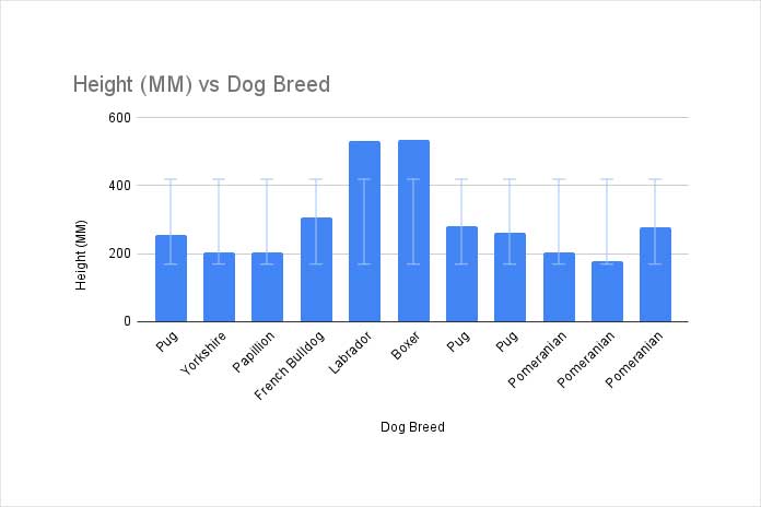
Quick Method: Use Error Bars
Google Sheets includes a basic way to add standard deviation—via Error Bars.
Steps:
- Select your data (e.g.,
A1:B12where A = labels, B = values). - Go to Insert > Chart and select a Column chart.
- In the Chart editor > Customize > Series, check Error Bars.
- Set the type to Standard deviation. Use the default value
1.
This method is easy, but the chart can look messy—especially if you want clear lines.
Why Add Mean and SD Lines?
Standard deviation (SD) tells you how spread out your values are. Adding a mean line and ±1 SD lines helps you:
- Visually detect outliers
- Identify clusters and variation
- Quickly compare data points to the average
Let’s now build a cleaner and more insightful version using a Combo chart.
Use Case Example: Dog Heights
Imagine you’re analyzing the height of 11 dog breeds. You want to see which dogs are close to average, and which are notably taller or shorter.
Step 1: Format Your Data
You’ll need three new columns: Average, SD Below, and SD Above.
| Dog Breed | Height (mm) | Average | -1 SD | +1 SD |
|---|---|---|---|---|
| Pug | 254 | |||
| … | … |
Leave columns C to E blank except for the header row (C1:E1).
Note: When entering the column header “+1 SD”, Google Sheets might treat it as a formula and show an error. To avoid this, type it as '+1 SD (with a leading apostrophe). The apostrophe won’t appear in the cell, but it prevents formula interpretation.
Step 2: Add Array Formulas
Paste these formulas in row 2:
C2 (Average):
=ArrayFormula(IF(LEN(B2:B12), AVERAGE(B2:B12), ))D2 (-1 SD):
=ArrayFormula(IF(LEN(B2:B12), C2 - STDEV.S($B$2:$B$12), ))E2 (+1 SD):
=ArrayFormula(IF(LEN(B2:B12), C2 + STDEV.S($B$2:$B$12), ))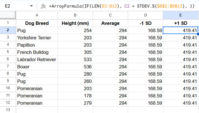
We use STDEV.S assuming this is a sample, not the full population.
Step 3: Insert and Configure the Chart
- Select
A1:E12 - Go to Insert > Chart
- In the Chart editor, set:
- Chart type: Combo
- Stacking: None
- Data range:
A1:E12 - X-axis: Dog Breed
- Series:
- Height (mm) → Column
- Average → Line
- -1 SD → Line
- +1 SD → Line
- “Use row 1 as headers” is enabled
- “Use column A as labels” is checked
- Under Customize > Series, ensure:
- Each line series uses a different color (e.g., red for mean, green for SD lines)
You now have a visual chart that shows exactly where each dog breed stands in relation to the mean and standard deviation.
Final Result Preview
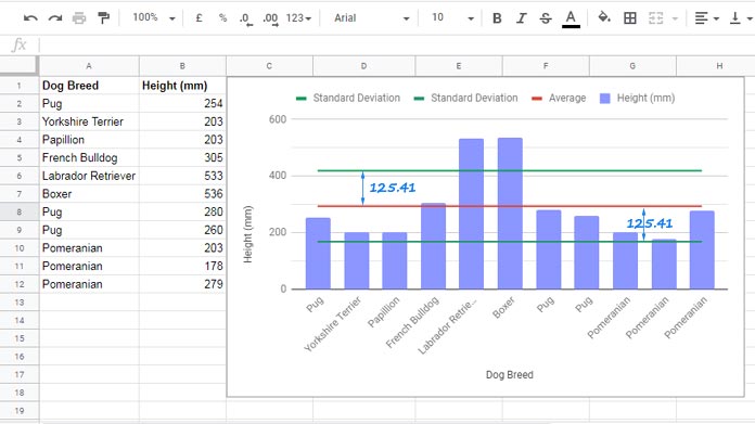
- Red line = Mean
- Green lines = ±1 Standard Deviation
- Blue columns = Actual heights
It’s much more informative than just error bars—and easier to interpret.
Summary: Best Way to Add Mean and SD to Charts
| Method | Visual Quality | Flexibility | Setup |
|---|---|---|---|
| Error Bars | ❌ Poor | Low | Easy |
| Combo Chart | ✅ Excellent | High | Medium |
If you want a clean, meaningful visual: Use the Combo chart method.