")
")


")


")

")
")
 in Excel & Google Sheets")


Looking to create a Column Chart with Red Colors for Negative Bars in Google Sheets? Or maybe a Bar Chart with Red Colors for Negative Bars? While Google Sheets doesn’t offer a built-in “Invert if Negative” option like Excel, there’s a simple workaround that lets you visually separate positive and negative values with different colors—automatically.
Tip: You can try this tutorial directly in my sample sheet (make a copy to edit).
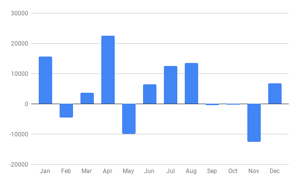
Default Column Chart Behavior in Google Sheets
Here’s what happens by default: when you insert a chart from a data range containing positive and negative values, all bars appear in the same color. There’s no built-in way to make negative bars red—at least not directly.
For example, take the following sample data (Sheet1, range A1:B13):
| Month | Profit/Loss |
| Jan | 15600 |
| Feb | -4500 |
| Mar | 3600 |
| Apr | 22525 |
| May | -10000 |
| Jun | 6500 |
| Jul | 12500 |
| Aug | 13500 |
| Sep | -500 |
| Oct | -250 |
| Nov | -12500 |
| Dec | 6800 |
To create a basic Column Chart:
- Select A1:B13.
- Go to Insert > Chart.
- In the Chart Editor under the Setup tab, set the Chart Type to “Column chart”.
You’ll now see a chart where both positive and negative bars are the same color.
How to Create a Column Chart with Red Colors for Negative Bars in Google Sheets
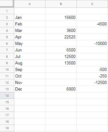
Here’s how to make the negative bars red using a clever data formatting trick.
In a new sheet:
- A2:
=Sheet1!A2 - B2:
=IF(Sheet1!B2>0, Sheet1!B2, )(Positive values) - C2:
=IF(Sheet1!B2<0, Sheet1!B2, )(Negative values)
Drag the formulas down to row 13. You’ll now have:
- Column A: Month
- Column B: Positive values only
- Column C: Negative values only
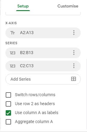
Select A2:C13 and insert a Column Chart. Under the Setup tab:
- Chart Type: Column chart
- Stacking: None
- X-axis: A2:A13
- Series: Columns B2:B13 and C2:C13
You’ve now created a Column Chart with Red Colors for Negative Bars in Google Sheets—with color automatically based on value sign.
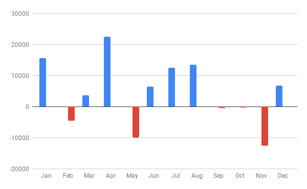
To customize the bar colors:
- Go to Customize > Series in the Chart editor.
- Assign a standard color (e.g., blue) to the positive values series.
- Assign red or orange to the negative values series.
What If I Have Two Series?
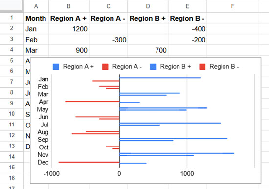
Let’s say you’re comparing profits/losses from two regions. Try this sample data (Sheet3, A1:C13):
| Month | Region A | Region B |
| Jan | 1200 | -400 |
| Feb | -300 | -200 |
| Mar | 900 | 700 |
| Apr | -800 | 300 |
| May | 1300 | 1000 |
| Jun | -650 | -300 |
| Jul | 1500 | 600 |
| Aug | -500 | -700 |
| Sep | 1600 | 800 |
| Oct | -200 | -100 |
| Nov | 1700 | 1100 |
| Dec | -900 | 400 |
Now format the data in Sheet4:
- A2:
=Sheet3!A2 - B2:
=IF(Sheet3!B2>0, Sheet3!B2, ) - C2:
=IF(Sheet3!B2<0, Sheet3!B2, ) - D2:
=IF(Sheet3!C2>0, Sheet3!C2, ) - E2:
=IF(Sheet3!C2<0, Sheet3!C2, )
Drag these down to row 13. In A1:E1, label the columns: Month, Region A +, Region A -, Region B +, Region B -
Select A1:E13 and insert a chart:
- Chart Type: Column chart (or Bar chart if preferred)
- Under Customize > Series, assign colors:
- Use blue for
Region A +andRegion B + - Use red for
Region A -andRegion B -
- Use blue for
You now have a Bar Chart with Red Colors for Negative Bars in Google Sheets, perfectly visualizing both regional gains and losses.
Final Tips
- You can turn off the legend under Customize > Legend > Position: None for a cleaner look.
- The same logic applies whether you’re creating a column chart or a bar chart—the key is splitting the data into positive and negative series.
Hi, there – you may have noticed there’s a slight offset between the bars of different colors, which looks a little odd.
The way around this is to change the chart type to “Stacked column chart.”
All the bars then have a uniform width.
Hi, Stephen Wheeler,
Thanks for your valuable input.
Thank you!