This tutorial explains how to create a Radar Chart, also known as a Spider Chart, in Google Sheets with step-by-step instructions.
A Radar Chart is a simple two-dimensional chart. You can arrange data in columns or rows in a worksheet to plot in a radar chart.
In this chart, you can show one or more variables or multivariate data, with one spoke for each variable. Data points are drawn clockwise around the chart.
Purpose of a Radar Chart or Radar Graph
You can use a Google Sheets Radar Chart, also known as a Spider Chart, similar to a Column Chart for comparison.
When the number of variables is large, use a Radar Chart, which offers a clutter-free data visualization experience. It allows you to see the relative strengths and weaknesses of different variables at a glance.
However, in my opinion, the readability of a Radar Chart is far behind that of a Column Chart. While Radar Charts are useful for showing relationships between multiple variables, they can become difficult to interpret when dealing with complex datasets.
Therefore, it’s important to choose the chart type that best fits your specific data and presentation needs.
How to Create a Radar Chart in Google Sheets
Below are two examples: one compares the allocated budget versus actual expenses, and the other compares the performance of two smartphones. Both are small and fictional datasets used to easily explain the chart.
Example 1: Allocated Budget vs Actual Expenses
My sample data consists of various expense categories in column A and the corresponding allocated budget and actual spending amounts in columns B and C.
Let’s compare my monthly allocated budget and actual spending using a Radar Chart in Google Sheets.
Sample Data for Radar Chart Creation:
| Expenses | Allocated Budget (in thousands) | Actual Spending (in thousands) |
| Sales | 10 | 9 |
| Marketing | 15 | 14 |
| Development | 20 | 18 |
| Customer Support | 35 | 30 |
| Information Technology | 40 | 40 |
| Administration | 5 | 4 |
Steps to Create a Radar Chart:
- Select the data.
- Go to the Insert menu and click on Chart.
- Under Chart Type, select Radar Chart.
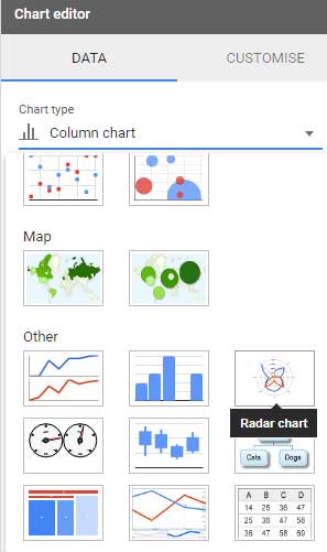
- The Radar Chart will be inserted as shown below.
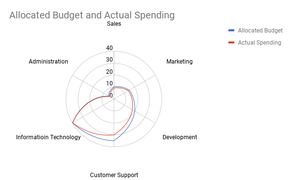
Example 2: Smartphone Performance Comparison
Here is one more Radar Chart where I compare some of the features of two smartphones. See that below.
Please note that this comparison has nothing to do with the original phone’s features. It’s just sample data.
The sample data consists of phone features in column A and corresponding performance ratings of phone 1 in column B and phone 2 in column C.
| Category | Phone 1 | Phone 2 |
| Performance | 5 | 5 |
| Display | 4 | 4.5 |
| Storage | 4 | 4 |
| Camera | 4 | 4.5 |
| Battery | 4 | 3.5 |
| RAM | 4 | 4.5 |
To create this Radar Chart, select the data and click Insert > Chart, then choose Radar Chart.
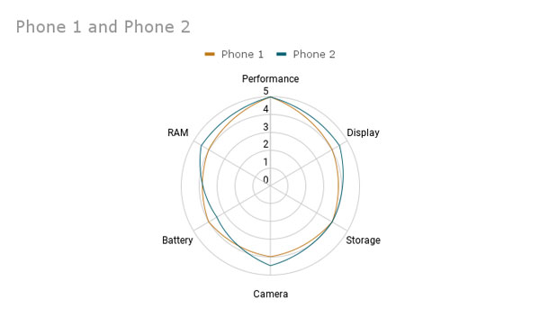
Customizing Radar Charts in Google Sheets
Radar Charts in Google Sheets typically require minimal customization. You may need to adjust the chart title according to your needs and possibly turn off axis titles, among other adjustments.
You can access all Radar Chart customization options within the “Customize” tab of the chart editor sidebar panel.
If the panel isn’t open, double-click any blank area of the chart.
Customization Options Include:
- Chart and Axis Titles: Add or remove chart titles, subtitles, and axis titles.
- Series: Modify line colors and adjust data point size and shape.
- Legend: Toggle legends on or off and adjust their position within the chart area.
These settings are essential for fine-tuning your Radar Chart to suit your needs.




Hi, how I could show the value of series for all axles? On Radar from Sheets, you can see just the values in one axle.