


")


")

")
")
 in Excel & Google Sheets")


In a heat map, color intensities represent different values. For an accounts receivable (AR) aging heat map, these color intensities will reflect the aging of invoices from their due dates. This tutorial explains how to create an AR aging heat map in Google Sheets.
A heat map in Google Sheets, also known as a color scale, is readily available under the Conditional Formatting menu, and applying a basic colorful heat map is straightforward.
However, creating a custom AR aging heat map requires using some custom formulas.
Before diving into how to create a custom AR heat map, here are the steps for applying a regular heat map in Google Sheets:
Heat Map in Google Sheets
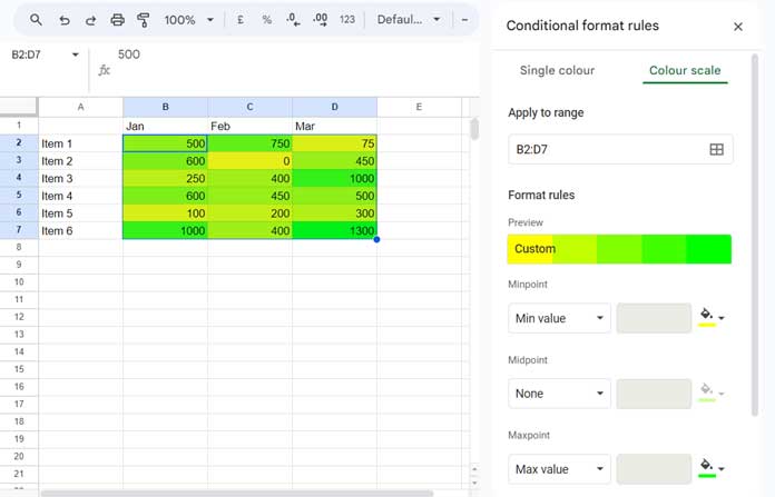
Assume we have sales values for three months in the range B2:D7.
- Select the Range: Highlight the range B2:D7.
- Open Conditional Formatting: Go to Format > Conditional Formatting > Color Scale.
- Set Color Scale:
- Set the “Min value” to Yellow.
- Set the “Max value” to Green.
- Set the “Midpoint” to None (or adjust as needed).
Note: You can choose any colors of your choice, but ensure all colors are distinct.
Now let’s move on to creating the custom AR aging heat map.
Example: Creating an AR Aging Heat Map in Google Sheets
Creating an Accounts Receivable (AR) heat map in Google Sheets involves visualizing the aging of invoices using conditional formatting.
- Prepare Your Data:
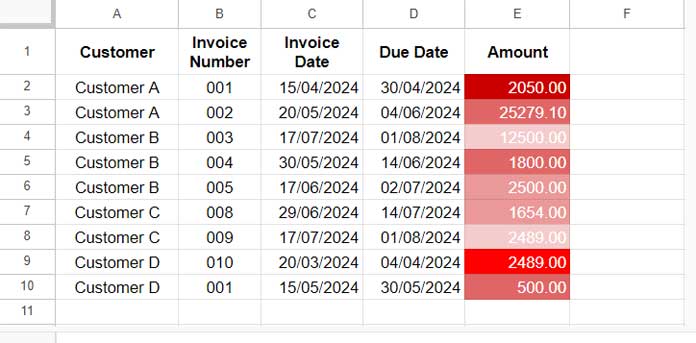
Create a table with your AR data, including columns for Customer, Invoice Number, Invoice Date, Due Date, and Amount.
For example, your data might look like this (in range A1:E10):
| Customer | Invoice Number | Invoice Date | Due Date | Amount |
| Customer A | 001 | 15/04/2024 | 30/04/2024 | 2050.00 |
| Customer A | 002 | 20/05/2024 | 04/06/2024 | 25279.10 |
| Customer B | 003 | 17/07/2024 | 01/08/2024 | 12500.00 |
| Customer B | 004 | 30/05/2024 | 14/06/2024 | 1800.00 |
| Customer B | 005 | 17/06/2024 | 02/07/2024 | 2500.00 |
| Customer C | 008 | 29/06/2024 | 14/07/2024 | 1654.00 |
| Customer C | 009 | 17/07/2024 | 01/08/2024 | 2489.00 |
| Customer D | 010 | 20/03/2024 | 04/04/2024 | 2489.00 |
| Customer D | 001 | 15/05/2024 | 30/05/2024 | 500.00 |
- Define Aging Intervals:
Use the following formulas within Conditional Formatting to highlight invoices based on aging, as detailed in the third step below:
- Current:
=DAYS(TODAY(), $D2) < 1(Invoices that are not past due) - 1-30 days:
=DAYS(TODAY(), $D2) < 31(Invoices that are 1-30 days past due) - 31-60 days:
=DAYS(TODAY(), $D2) < 61(Invoices that are 31-60 days past due) - 61-90 days:
=DAYS(TODAY(), $D2) < 91(Invoices that are 61-90 days past due) - 90+ days:
=$D2 > 90(Invoices that are more than 90 days past due)
- Apply Conditional Formatting:
- Select the Range: Highlight the range E2:E10 (where you want to apply the aging heat map).
- Open Conditional Formatting: Click Format > Conditional Formatting.
- Set Up Formatting Rules:
- Rule 1: Under “Format cells if”, select “Custom formula is” and enter
=DAYS(TODAY(), $E2) < 1. Choose a fill color such as Light Red 3. (You can pick your color, but ensure color intensity increases with each step.) - Add Another Rule: Enter
=DAYS(TODAY(), $E2) < 31. Choose a fill color such as Light Red 2 and set the text color to White. - Add Another Rule: Enter
=DAYS(TODAY(), $E2) < 61. Choose a fill color such as Light Red 1 and set the text color to White. - Add Another Rule: Enter
=DAYS(TODAY(), $E2) < 91. Choose a fill color such as Dark Red 1 and set the text color to White. - Add Another Rule: Enter
=$E2 > 90. Choose a fill color such as Red and set the text color to White.
- Rule 1: Under “Format cells if”, select “Custom formula is” and enter
- Finish: Click Done.
Your AR aging heat map is now ready.