


")


")

")
")
 in Excel & Google Sheets")


Of course, you can use a slicer to filter your charts in Google Sheets. But sometimes, you might want more control over your chart filtering by adding a custom formula in a slicer.
For example, consider a vehicle trip log where you create a column chart to visualize the total distance traveled by each vehicle.
How do you dynamically visualize underperforming vehicles? For example, show only vehicles that have traveled less than 15,000 km. Similarly, you may want to display only the vehicles that have consumed more than 2,000 gallons of fuel.
To dynamically filter a chart in Google Sheets based on data totals, you can use a custom formula in a slicer.
Below, you’ll see how adding a custom formula in a slicer allows you to filter the chart based on data totals.
Sample Data
The sample data in Sheet1 consists of vehicle numbers, months, and fuel consumption in columns A, B, and C, respectively.
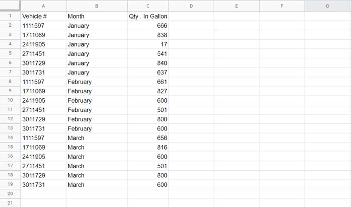
This dataset represents diesel consumption for six vehicles from January to March.
You can explore the sample data used in this tutorial by clicking the button below. This will help you follow along and practice adding a custom formula in a slicer for charts in Google Sheets.
Let’s create a chart that displays vehicles and their total fuel consumption. Then, we’ll dynamically filter the chart to show only vehicles that consumed more than 2,000 gallons of fuel.
1. Creating a Column Chart with Fuel Consumption
- Navigate to Sheet2.
- Click Insert > Chart.
- In the Chart editor sidebar, select Column Chart.
- Under Data range, enter:
Sheet1!A1:C - Under X-Axis, select Vehicle.
- Check the Aggregate option.
- Under Y-Axis, select Qty. in Gallons and set the Series to Sum.
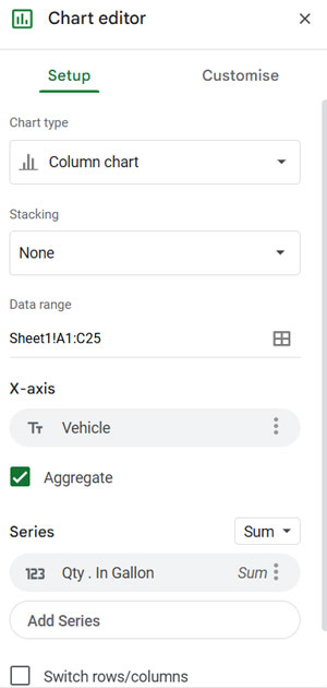
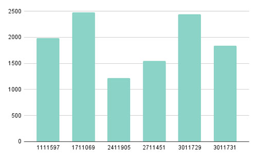
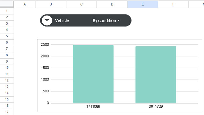
Your Column Chart is now ready. It displays each vehicle and its total fuel consumption.
Next, let’s add a slicer and a custom formula to filter vehicles that consumed more than 2,000 gallons of fuel.
2. Creating the Slicer for the Column Chart
- In Sheet2, where the chart is located, go to Data > Add a Slicer.
- In the Select a data range field, enter:
Sheet1!A1:C - Click OK.
- In the Column field, select Vehicle.
Your slicer is now ready to filter the chart. You can manually select specific vehicles, but our goal is to filter only vehicles that consumed 2,000 gallons or more.
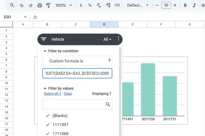
3. Adding a Custom Formula in a Slicer for the Chart
- Click the filter drop-down in the slicer.
- Select Filter by condition > Custom formula is.
- Enter the following formula:
=SUMPRODUCT($A$2:$A=$A2, $C$2:$C)>2000 - Click OK.
Now, the chart will only display vehicles whose total fuel consumption exceeds 2,000 gallons.
Explanation of the Custom Formula Used in the Slicer
The formula is based on SUMPRODUCT, which calculates the total fuel consumption for each vehicle:
$A$2:$A=$A2- Checks if the vehicle number in column A matches the vehicle in row 2.
- Returns an array of TRUE (1) and FALSE (0).
$C$2:$C- Represents the fuel consumption data.
- Since TRUE = 1 and FALSE = 0, multiplying these arrays sums the total fuel consumption for each vehicle.
- If the SUMPRODUCT result is greater than 2,000, the slicer keeps the row; otherwise, it filters it out.
This condition applies dynamically to each row in the source data.
Filtering a Chart Based on Data Totals and Updating for New Data
When you add or modify the source data, the changes may not immediately reflect in the chart. To refresh it:
- Click the Slicer drop-down.
- Click OK (without changing any settings).
This forces the chart to update and apply the latest filtering conditions.
Conclusion
By adding a custom formula in a slicer, you can dynamically filter charts based on data totals without modifying the original dataset. Whether you’re filtering based on total fuel consumption, distance traveled, or any other metric, this method provides a powerful way to refine your charts in Google Sheets.