 in Google Sheets")

")

")


")


")


Currently, in Google Sheets, a scorecard chart allows you to select from two baseline value options:
- Absolute change value
- Percentage change value
Ironically, we can only display one of them at a time in the scorecard chart.
But with a simple and effective workaround, we can show two baseline values in a scorecard chart.
This is done by creating two scorecard charts using the same values (Key Performance Indicators aka KPIs):
- One chart includes all the required parameters.
- The second chart includes only the baseline value you couldn’t show in the first.
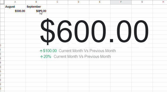
In the example below, you’ll see both baseline values displayed beneath a single key value.
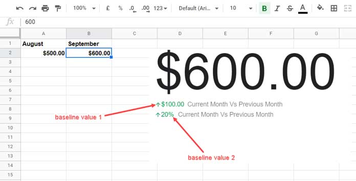
Baseline Values in a Scorecard Chart – Introduction
The key value and baseline values are the two core elements of a scorecard chart in Google Sheets.
In the example above, $600 is the key value. Below that, you’ll notice two baseline values.
Personally, I feel a scorecard chart without at least one baseline value (or preferably two) feels lifeless.
Without it, the chart resembles a simple text object showing a number that updates based on a cell value—useful, yes, but lacking impact for KPIs.
A baseline value adds life to the chart by showing the relationship between the current value and a previous benchmark in one of two ways:
- Absolute change
Formula:key_value - baseline_value
Example:=B2 - A2 - Percentage change
Formula:(key_value / baseline_value * 100%) - 100%
Example:=TO_PERCENT(B2 / A2 * 100% - 100%)
In our case, ↑$100 is the absolute change, and ↑20% is the percentage change. But the chart settings only allow one of these values at a time!
So here’s how to show two baseline values in a scorecard chart in Google Sheets.
Workaround to Get Two Baseline Values in a Scorecard Chart
Step 1: Creating the First Scorecard Chart
Assume A2 and B2 contain income data from August and September respectively.
To create the scorecard chart:
- Click a blank cell (e.g.,
D2). - Go to Insert > Chart.
- In the Chart Editor sidebar, set Chart type to Scorecard chart.
- Under Key value, select
B2. - Under Baseline value, select
A2.
Your scorecard chart is ready with one baseline value.
By default, it shows absolute change—you can switch it to percentage change if needed.
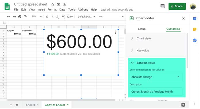
Go to the Customize tab and tweak the appearance. For example:
- Increase the baseline value font size to
18 - Add a custom description
- Under Chart style, set:
- Border color to
None - Background color to
Grey(We’ll change it later)
- Border color to
Position the chart carefully—align the top edge to the 4th row for best results.
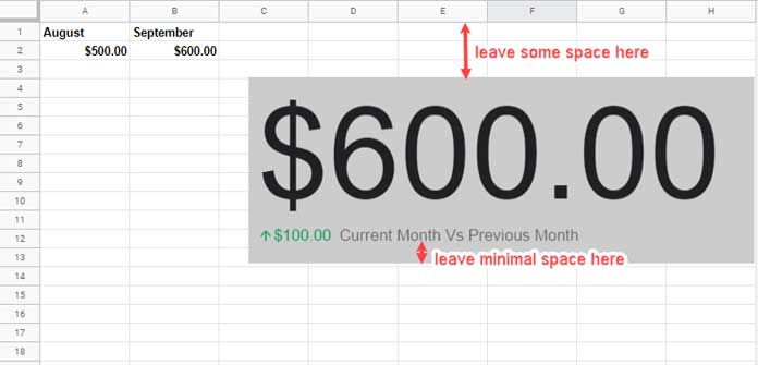
Then, reduce the chart height slightly by dragging the middle handle at the bottom. Leave minimal space below the baseline value.
Step 2: Creating the Second Scorecard Chart
Now let’s add the second baseline value.
- Click on the first chart.
- Press
Ctrl + C, thenCtrl + Vto duplicate it. - On the copied chart:
- Change the Background color to
White - Change the Baseline value to show the other metric (e.g., switch from absolute to percentage change)
- Change the Background color to
Align both charts perfectly. If needed, adjust positions by dragging.
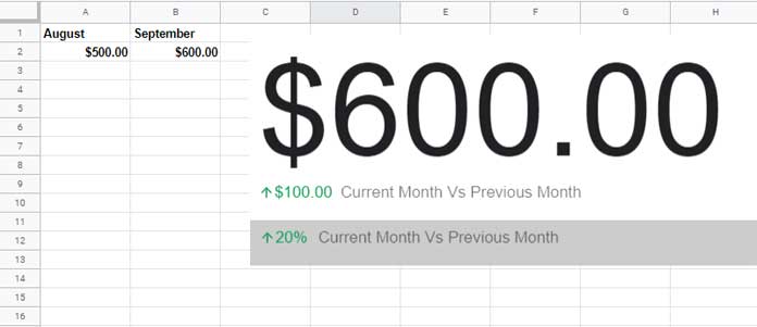
Finally, just change the first chart’s background color from Grey to White.
And voila! You now have two baseline values in a scorecard chart—one from each chart stacked together.
Additional Tips – Transparent Background
To go one step further with a clean, minimal look, you can make the backgrounds transparent.
Here’s how:
- First chart (bottom layer):
- Set Background color to
None - Change Key value font color to
White
- Set Background color to
- Second chart (top layer):
- Set Background color to
None
- Set Background color to
This gives you two baseline values and a transparent scorecard chart that blends nicely with your sheet.
That’s all! With this workaround, you can effectively show two baseline values in a scorecard chart in Google Sheets, making your KPIs more insightful and visually appealing.
Enjoy!