


")


")

")
")
 in Excel & Google Sheets")


Creating a shaded target range in a line chart (or other chart types like column, area, or stepped area charts) in Google Sheets can make your data visualization much clearer. This tutorial will guide you through the process step-by-step and applies equally well to line, column, area, or stepped area charts.
Why Use a Shaded Target Range in Google Sheets Charts?
Adding a shaded target range to your chart helps you quickly identify whether data points fall within, above, or below your desired range. It makes analyzing trends and performance against targets much easier and more intuitive.
Real-Life Example of a Shaded Target Range in a Line Chart
Consider a blog tracking monthly traffic (visitors) from January to December. The webmaster sets a monthly target range of 150,000 to 300,000 visitors. The line chart below shows:
- Actual monthly visitors.
- Three shaded ranges:
- Below target (0 to 150,000 visitors)
- Target range (150,000 to 300,000 visitors)
- Above target (above 300,000 visitors)

From this chart, it’s easy to see when traffic met, exceeded, or fell short of expectations.
How to Create a Shaded Target Range in a Line Chart in Google Sheets
You can create a shaded target range not only in line charts but also in column, area, or stepped area charts in Google Sheets. In this tutorial, we’ll focus on the line chart, but the steps to switch chart types are straightforward.
Step 1: Prepare Your Data
Start with your data, for example:
| Months | Traffic |
|---|---|
| Jan | 230000 |
| Feb | 230000 |
| Mar | 250000 |
| Apr | 250000 |
| May | 300000 |
| Jun | 300000 |
| Jul | 350000 |
| Aug | 350000 |
| Sep | 300000 |
| Oct | 300000 |
| Nov | 285000 |
| Dec | 285000 |
Step 2: Add Columns for Shaded Ranges
You need to add three extra columns:
- Lower Limit (e.g., 150,000)
- Upper Limit (e.g., 300,000)
- Above Upper Limit (values above 300,000 or zeros if not applicable)
Example data format:

Note: Enter the lower and upper limit values in their respective columns. The ‘Above Upper Limit’ column (column E) should be temporarily filled with zeros. After creating the chart, update this column to match the maximum value used in the vertical axis scale to ensure correct shading.
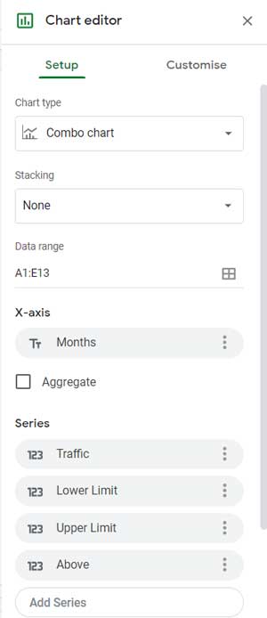
Step 3: Insert the Chart
- Select your data range including the new columns (A1:E13).
- Go to Insert > Chart.
- In the Chart Editor > Setup tab:
- Set Chart type to Combo chart.
- Set Stacking to None.
- Make sure your X-axis is Months.
- Add all series: Traffic, Lower Limit, Upper Limit, Above Upper Limit.
- Check Use row 1 as headers.
- Check Use column A as labels.
Step 4: Customize the Chart
Go to the Customize tab in the Chart Editor.
- Click on Series.
- Set Traffic series to Line.
- Set the other series (Lower Limit, Upper Limit, Above Upper Limit) to Stepped Area to create the shaded effect.
Note: After setting up the chart, check the Y-axis maximum scale. Then update the “Above Upper Limit” column (column E) with this max value (e.g., 400,000) to ensure the shaded range displays correctly.
Optional: Change Chart Type
If you prefer a shaded column chart, change the Traffic series type from Line to Column under the Customize tab.
Summary
Adding a shaded target range in Google Sheets charts helps make your data insights clearer and easier to understand. Whether you are tracking sales, test scores, or website traffic, this technique highlights performance relative to your target range.
Feel free to explore the Combo chart and customize it for your needs. This approach works seamlessly across different chart types—line, column, area, or stepped area—giving you flexible options for your data visualization.
Sample Sheet
If you’d like to try this yourself, copy the example Google Sheet below, which contains both the sample data and the completed chart.
Related Resources
- Get a Target Line Across a Column Chart in Google Sheets
- How to Add an Average Line to Charts in Google Sheets
- Mean and Standard Deviation Lines on Google Sheets Chart
- How to Add Legend Next to Series in Line and Column Charts in Google Sheets
- Show Vertical Gridlines in Google Sheets Charts (Horizontal Axis Fix)
- How to Add a Vertical Line to a Line Chart in Google Sheets
- Automate Multi-Colored Line Charts in Google Sheets
- How to Make a Vertical Line Graph in Google Sheets (Workaround)