
 in Google Sheets")

")


")


")


With historical rainfall data, you can easily create a rainfall chart in Google Sheets to analyze weather patterns and their impacts. Such a chart can be helpful in many contexts.
For example, if you work in construction, outdoor activities might be delayed or interrupted by rain, impacting schedules and budgets. With a clear visual representation of rainfall patterns, you can better plan work activities, especially if you are new to the area.
A rainfall chart can help you plan indoor tasks for rainy periods and focus outdoor work on drier days, optimizing your resources and reducing weather-related delays.
Finding Historical Rainfall Data
For accurate data, visit official sources like your country’s meteorological department website or reputable climate databases. Many of these resources offer monthly or annual rainfall data in millimeters. Here, I’ll demonstrate how to create an annual rainfall chart using monthly data.
If you also have data on the number of rainy days per month, you can include that to create a more detailed chart.
Sample Data Format for an Annual Rainfall Chart in Google Sheets
Start by formatting your rainfall data in a simple table. Use two rows: the first row for month names and the second row for rainfall data in millimeters (mm) for each month.
For example, the data in A1:M2 would look like this:
| Month | Jan | Feb | Mar | Apr | May | Jun | Jul | Aug | Sep | Oct | Nov | Dec |
| Rainfall (mm) | 18.4 | 1 | 31.9 | 140.3 | 189.8 | 669.1 | 630 | 358.3 | 273.8 | 442.5 | 339 | 47.9 |
Example Data Source: This rainfall data is based on historical rainfall data from Kerala, India, in 2010, obtained from data.gov.in. This example is solely for instructional purposes to guide you in creating a rainfall chart in Google Sheets
Steps to Create an Annual Rainfall Chart in Google Sheets
Once you have entered and arranged your data as shown, you can create a rainfall chart in just two steps:
- Select the Range: Highlight the range
A1:M2. - Insert Chart: Go to Insert > Chart.
Google Sheets will analyze your data and automatically generate a column chart. If the chart doesn’t display correctly, use the following settings in the Chart Editor:
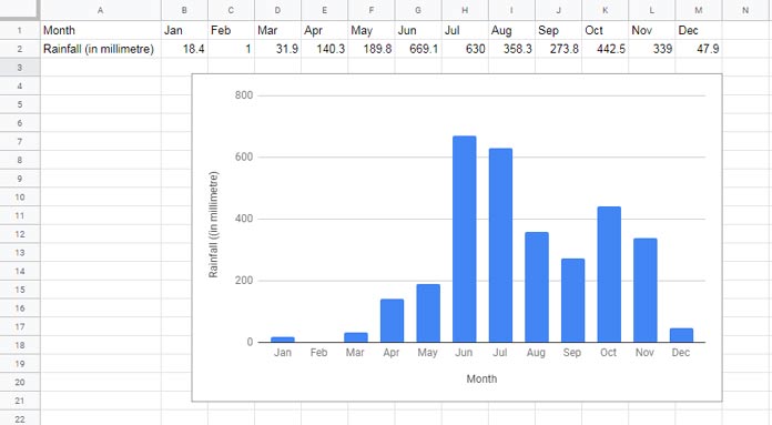
Chart Editor Settings (Under Setup):
- Chart Type: Column Chart
- Stacking: None
- Data Range: A1:M2
- X-Axis: Month
- Series: Rainfall (mm)
Additional Settings:
- Uncheck Aggregate
- Check Switch Rows/Columns
- Check Use column A as headers
- Check Use row 1 as labels
Including Rainy Days in the Rainfall Chart
If you want to add the number of rainy days per month, you can include a third row in your data. For example, use Row 3 to record the number of rainy days:
| Month | Jan | Feb | Mar | Apr | May | Jun | Jul | Aug | Sep | Oct | Nov | Dec |
| Rainfall (mm) | 18.4 | 1 | 31.9 | 140.3 | 189.8 | 669.1 | 630 | 358.3 | 273.8 | 442.5 | 339 | 47.9 |
| Rainy Days | 3 | 1 | 5 | 14 | 18 | 27 | 28 | 24 | 16 | 24 | 12 | 5 |
To create a combo chart displaying both rainfall and rainy days:
- Select the Range: Highlight the range
A1:M3. - Insert Chart: Go to Insert > Chart.
Chart Editor Settings (Under Setup):
- Chart Type: Combo Chart
- Stacking: None
- Data Range:
A1:M3 - X-Axis: Month
- Series: Rainfall (mm), Rainy Days
Additional Settings:
- Uncheck Aggregate
- Check Switch Rows/Columns
- Check Use column A as headers
- Check Use row 1 as labels
Chart Editor Settings (Under Customize):
- Go to Series > Select Rainy Days
- Set Type to Line
- Set Axis to Right
- Ensure the Rainfall (mm) series is set to Columns.
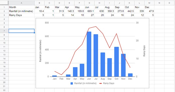
Customizing Vertical Axis Titles in a Combo Chart
In the combo chart, you’ll have two vertical axes: one for Rainfall and another for Rainy Days. To label each axis:
- Go to Chart Editor > Customize > Chart and Axis Titles.
- Select the Vertical axis title and name it Rainfall (in mm).
- Select the Right vertical axis title and name it Rainy Days.
With these steps, you’ve successfully created a combined chart in Google Sheets that displays both annual rainfall and the number of rainy days per month, providing valuable insights into seasonal patterns. This can be a powerful tool for planning and resource allocation in weather-dependent projects.