 in Google Sheets")

")

")


")


")


Using an additional series that contains two data points, we can add a vertical line to a line chart in Google Sheets. However, this depends on the formatting of the category/horizontal axis (x-axis). If your category axis contains numeric, date, or time values, the method will work as expected.
The x-axis in a line chart typically contains dates, months, or years since it is used to visualize changes in values over time.
Purpose of Adding a Vertical Line to a Line Chart
Adding a vertical line to a line chart in Google Sheets helps highlight key dates, events, or thresholds, making data interpretation easier. It can mark significant moments such as a policy change or deadline, allowing for a clearer analysis of trends before and after the event.
A vertical line also helps compare different data segments, visually separating phases for better insights. Additionally, it can indicate benchmarks or targets, such as sales goals or critical thresholds, making it easier to assess performance.
In short, by enhancing readability and supporting decision-making, a vertical line improves the overall effectiveness of data visualization in Google Sheets.
Adding a Vertical Line to a Line Chart with One Series
1. Understanding the Data
In the following example, the category axis contains dates. The source data is in the range B1:C, where B2, B3, B4… contain 1/1/22, 1/2/22, 1/3/22, etc. This means the x-axis consists of dates. There is only one series (y-axis), which is in the range C1:C.
| Month | Amount 1 |
| 01/01/2022 | 100 |
| 01/02/2022 | 150 |
| 01/03/2022 | 25 |
| 01/04/2022 | 175 |
| 01/05/2022 | 100 |
| 01/06/2022 | 250 |
| 01/07/2022 | 150 |
| 01/08/2022 | 100 |
| 01/09/2022 | 75 |
| 01/10/2022 | 100 |
| 01/11/2022 | 150 |
| 01/12/2022 | 150 |
Here are the required steps to add a vertical line to a line chart in Google Sheets:
2. Positioning the Vertical Line on the Category Axis
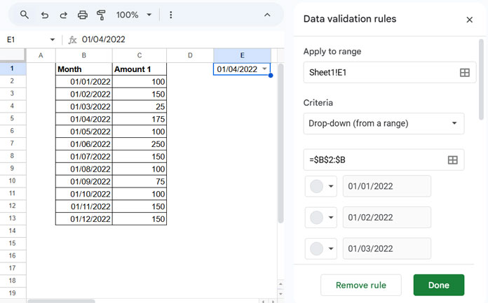
We will use cell E1 to control the position of the vertical line. To do this, create a drop-down menu in E1 with category values.
- Navigate to cell
E1. - Click Insert > Drop-down.
- In the Data validation rules panel, select Drop-down (from a range) under Criteria.
- In the field below, enter
B2:Band click Done. - Now, in the drop-down menu in
E1, select any date, for example, 01/04/2022.
3. Helper Range (Source Data for the Chart)
In cell F1, enter the following formula to generate the helper table for the chart:
=IFNA(VSTACK(HSTACK(FILTER(B1:C, CHOOSECOLS(B1:C, 1)<>""), "Focus Line"), VSTACK(HSTACK(E1, ,0), HSTACK(E1, , MAX(CHOOSECOLS(B1:C, 2))))))Where B1:C is the source data range, and E1 is the cell containing the date on the x-axis that controls the position of the vertical line in the line chart. This formula will generate the required range in F1:H for plotting the chart.
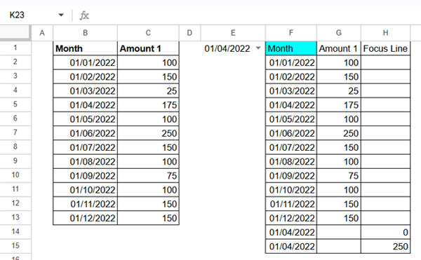
4. Formatting the Data
You may need to format the date in F2:F.
- Navigate to cell
B2. - Right-click and select Copy.
- Select
F2:F. - Right-click and select Paste Special > Format Only.
5. Creating and Adding a Vertical Line to a Line Chart
Select F1:H and go to Insert > Chart to create a line chart with a vertical line.
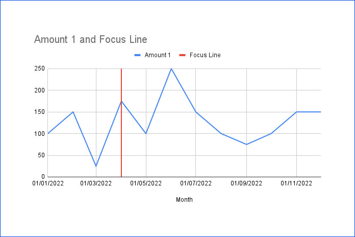
If the vertical line does not appear as expected, check the settings in the Chart Editor against the ones below. Also, compare them with the sample sheet provided at the end of this post.
Chart Editor – Setup Tab:
- Chart Type: Line Chart
- Data Range: F1:H15
- X-axis: Month
- Series:
- Amount 1
- Focus Line
- Options:
- ✅ Use Row 1 as Headers
- ✅ Use Column F as Labels
Formula Logic and Explanation
To add a vertical line to a line chart, we need to create a helper series with two data points—one containing 0 and the other containing the maximum value in the series.
Explanation:
=IFNA(VSTACK(HSTACK(FILTER(B1:C, CHOOSECOLS(B1:C, 1)<>""), "Focus Line"), VSTACK(HSTACK(E1, , 0), HSTACK(E1, , MAX(CHOOSECOLS(B1:C, 2))))))FILTER(B1:C, CHOOSECOLS(B1:C, 1)<>"")– Filters the source data to remove empty rows.HSTACK(..., "Focus Line")– Adds a third column with the title “Focus Line”.VSTACK(HSTACK(E1, ,0), HSTACK(E1, ,MAX(CHOOSECOLS(B1:C, 2))))– Vertically stacks two rows: the first row contains0, and the second row contains the maximum value in the third column. The first column will be the control date from the drop-down.
This setup allows us to add a vertical line to the line chart in Google Sheets.
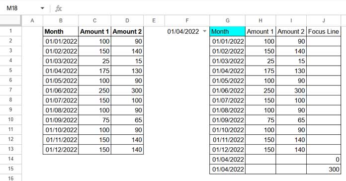
Adding a Vertical Line to a Line Chart with Two or More Series
In the first example, we used only one series, labeled “Amount 1”. However, if we have two series, such as “Amount 1” and “Amount 2”, the data will be in columns B1:D, with the control drop-down in cell F1.
Here is the modified formula:
=IFNA(VSTACK(HSTACK(FILTER(B1:D, CHOOSECOLS(B1:D, 1)<>""), "Focus Line"), VSTACK(HSTACK(F1, , , 0), HSTACK(F1, , , MAX(CHOOSECOLS(B1:D, {2, 3}))))))In this formula, B1:D is the range containing the source data, and F1 is the control drop-down. We modified HSTACK(F1, , ,0) and HSTACK(F1, , , MAX(CHOOSECOLS(B1:D, {2, 3}))), adding three commas instead of two. Additionally, the MAX function now considers two columns {2, 3}.
If you have three series, the formula adjusts accordingly:
=IFNA(VSTACK(HSTACK(FILTER(B1:E, CHOOSECOLS(B1:E, 1)<>""), "Focus Line"), VSTACK(HSTACK(F1, , , , 0), HSTACK(F1, , , , MAX(CHOOSECOLS(B1:D, {2, 3, 4}))))))In this version, the formula now includes four commas in HSTACK(F1, , , , 0) and HSTACK(F1, , , , MAX(CHOOSECOLS(B1:E, {2, 3, 4}))) to accommodate three series.
Sample Sheet
Resources
- How to Move the Vertical Axis to the Right Side in a Google Sheets Chart
- Enabling the Horizontal Axis (Vertical) Gridlines in Charts in Google Sheets
- How to Make a Vertical Line Graph in Google Sheets (Workaround)
- Scatter Chart in Google Sheets and Its Difference from a Line Chart
- Sparkline Line Chart Formula Options in Google Sheets
- How to Plot a Line Chart Using Lap Times in Milliseconds in Google Sheets
- Create a Shaded Target Range in a Line Chart in Google Sheets