Google has quietly added a Waterfall Chart feature in Sheets. This means you can now create Waterfall charts with just one click. In this Google Sheets tutorial, you’ll learn how to create a McKinsey-Style Waterfall Chart.
I’m using the latest approach in Google Sheets to create the Waterfall chart. It’s quick, simple, and easy enough for even first-time users to follow.
Previous Approach
In the past, Google Sheets users created Waterfall charts using a Stacked Bar Chart. This method was time-consuming because it required arranging the data in a specific way.
For example, I used a similar approach with a Stacked Bar Chart to create a Gantt Chart in Google Sheets.
The process involved creating a Stacked Bar Chart and then removing the colors of certain data series to make the chart resemble a Waterfall or Gantt chart. But now, at least for creating Waterfall charts, you can say goodbye to this approach!
McKinsey-Style Waterfall Chart – What Is It?
McKinsey, a leading global management consulting firm, popularized Waterfall charts by extensively using them in their presentations to clients.
Waterfall charts are also known as Mario Charts. I prefer to call them Mario Charts because the columns in a Waterfall chart resemble the floating bricks in the Mario game.
Purpose
Use a Waterfall chart to visualize how an initial value is affected by a series of intermediate positive or negative values. For example, you can track revenue and expenses over time, clearly showing the contribution of each component. This approach simplifies the identification of key drivers and trends, making the data easier to interpret at a glance.
Creating a McKinsey-Style Waterfall Chart in Google Sheets
To show you how to create a McKinsey-Style Waterfall Chart, I’ll use a Waterfall Chart in Quantitative Analysis as an example.
Example 1: Quantitative Analysis
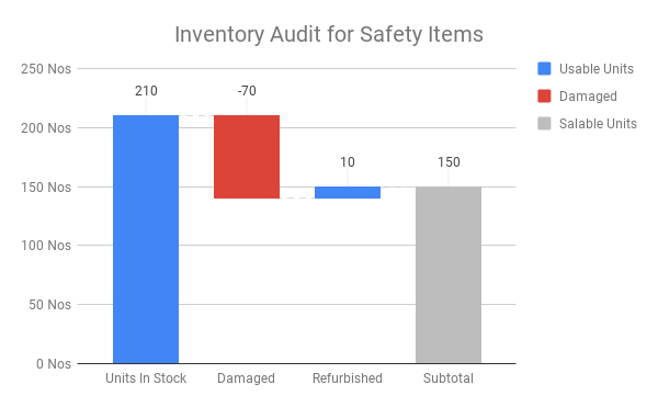
I have the following data in cells A1:B4:
| Description | Qty |
| Units in Stock | 210 |
| Damanged | -70 |
| Refurbished | 10 |
Steps:
- Select the data range A2:B4.
- Click on Insert > Chart.
- In the sidebar panel that opens, select Waterfall Chart under “Chart Type”.
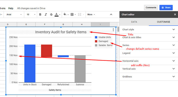
- Your chart is almost ready. You just need to customize it a bit to suit your needs. Here are the necessary customization options for the Waterfall chart:
See another example of a McKinsey-Style Waterfall Chart in Google Sheets, where I’ll use a cash flow statement for illustration.
Example 2: Waterfall Chart in Cash Flow Analysis
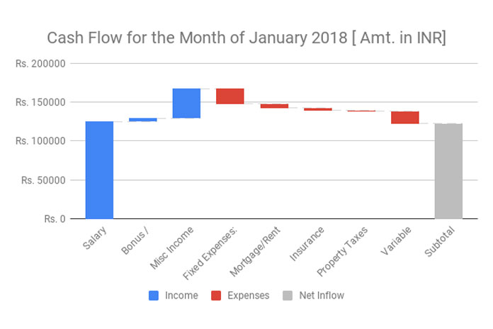
You can create a Waterfall Chart for your cash flow analysis. Let’s learn how to create a cash flow Waterfall Chart in Google Sheets. You can see the finished chart as the featured image at the top of this page.
Here is my sample data.
Income:
- Salary: $125,000.00
- Bonus/Commissions: $5,000.00
- Subtotal: $130,000.00
Other Income:
- Freelance/Consulting/Blogging Income: $12,000.00
- Government Benefits: $500.00
- Affiliate Marketing: $25,000.00
- Investment Income: $0.00
- Interest Income: $0.00
Subtotal (Other Income): $37,500.00
Total Inflow (Income + Other Income): $167,500.00
Expenses:
Fixed Expenses:
- Mortgage/Rent: $20,000.00
- Insurance Premiums: $5,000.00
- Property Taxes: $3,000.00
Subtotal (Fixed Expenses): $29,000.00
Variable Expenses:
- Groceries: $4,000.00
- Utilities: $6,000.00
- Medical Care: $500.00
- Entertainment/Hobbies: $500.00
- Dining Out: $1,500.00
- Maintenance/Home or Auto: $4,000.00
- Other: $0.00
Subtotal (Variable Expenses): $16,500.00
Total Outflow (Fixed Expenses+Variable Expenses): $45,500.00
To create a Waterfall Cash Flow chart, we should summarize the above data as follows:
| Salary: $125,000.00 |
| Bonus/Commissions: $5,000.00 |
| Misc Income: $37,500.00 |
| Fixed Expenses: -$20,000.00 |
| Mortgage/Rent: -$5,000.00 |
| Insurance Premiums: -$3,000.00 |
| Property Taxes: -$1,000.00 |
| Variable Expenses: -$16,500.00 |
Make sure to show expense values as negative numbers. Enter the labels in one column and the values in another.
Select this data to plot a Waterfall Cash Flow chart. You can follow the same steps detailed in my earlier example to create your Cash Flow Waterfall Chart.
Here’s my sample sheet:
I hope you’ve enjoyed your time here.


