


")


")

")
")
 in Excel & Google Sheets")


A Gantt Chart in Google Sheets is a great way to visualize project timelines. But what if you only want to see tasks within a specific date range? Applying a date filter in a Gantt Chart isn’t as straightforward as filtering data in a regular table.
In this guide, I’ll show you a simple way to filter tasks in a Gantt Chart by date using Sparkline formulas, without losing visibility of tasks that overlap your selected timeframe.

Why a Normal Date Filter Doesn’t Work in Gantt Charts
If you use Data > Create a filter in Google Sheets to filter tasks by the start date, you’ll run into a problem:
- Example: A task called “Drawing Approval” runs from 15-Nov-2021 to 20-Dec-2021.
- If you filter for tasks starting after 15-Dec-2021, this task disappears entirely—even though part of it continues into your selected range.
That’s why we need a formula-based approach to apply a custom date filter for Gantt Charts in Google Sheets.
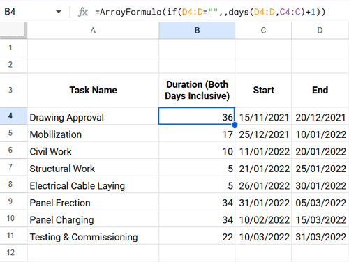
Step 1: Set Up Your Sample Gantt Chart Data
Copy the following data into A3:D11:
| Task Name | Duration (Both Days Inclusive) | Start | End |
| Drawing Approval | 15/11/2021 | 20/12/2021 | |
| Mobilization | 25/12/2021 | 10/01/2022 | |
| Civil Work | 11/01/2022 | 20/01/2022 | |
| Structural Work | 21/01/2022 | 25/01/2022 | |
| Electrical Cable Laying | 26/01/2022 | 30/01/2022 | |
| Panel Erection | 31/01/2022 | 05/03/2022 | |
| Panel Charging | 10/02/2022 | 15/03/2022 | |
| Testing & Commissioning | 10/03/2022 | 31/03/2022 |
Step 2: Insert Formulas
We’ll use three main formulas—for Duration, Timescale (date filter), and the Sparkline Gantt Chart.
2.1 Duration Formula
In cell B4, enter the following formula (it will auto-fill the column):
=ArrayFormula(IF(D4:D="",,DAYS(D4:D, C4:C)+1))This automatically calculates task durations.
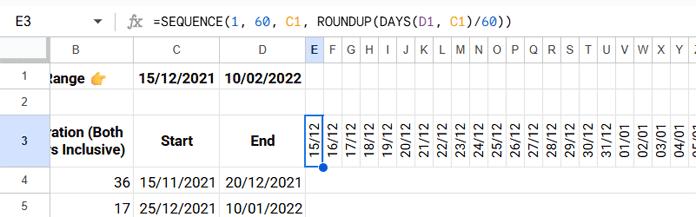
2.2 Timescale Formula (Date Filter Range)
- In C1, enter your start date (e.g.,
15/12/2021). - In D1, enter your end date (e.g.,
10/02/2022). - Add a validation rule to ensure D1 is always greater than C1. To do this, go to
Data > Data validation, chooseCustom formula is, and enter the formula below. Then click Done.
=AND(D1>C1, ISDATE(D1))- In E3, enter this SEQUENCE formula to generate your timeline:
=SEQUENCE(1, 60, C1, ROUNDUP(DAYS(D1, C1)/60))👉 If you use a 60-day window, the chart looks best when the date difference between C1 (start date) and D1 (end date) is also around 60 days.
Pro Tips for a Cleaner Gantt Chart View:
- Resize columns E:BL to
16pxfor a neat, compact timeline. (Right-click the column header → Resize column → Enter 16.) - Format the dates in the timescale row (E3:BL3) to show only day/month (
dd/mm). (Select the row → Format → Number → Custom number format → typedd/mm.) - Rotate text to 90° so the dates display vertically. (Select the row → Format → Rotation → Rotate up.)
2.3 Sparkline Gantt Chart Formula
In E4, enter this formula:
=IF(AND(ISDATE(C4), ISDATE(D4)),
  SPARKLINE(
    {MIN(MAX(C4, $C$1), $BL$3)-$C$1, MAX(MIN(D4, $BL$3), $C$1)-MIN(MAX(C4, $C$1), $BL$3)+1},
    {"charttype","bar"; "color1","white"; "color2","red"; "max",$BL$3-$C$1+1}
  ),
)
👉 Next, merge cells E4:BL4 so the Sparkline bar has space to stretch across the timeline.
(Select E4:BL4 → Go to the top menu → Format > Merge cells > Merge horizontally.)
Then copy it down for all tasks.
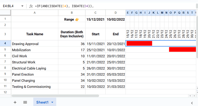
This formula ensures:
- Tasks starting before the filter window still appear, but truncated.
- Tasks ending after the filter window also adjust.
- The logical test at the beginning (
IF(AND(ISDATE(...)))) ensures the chart only populates when both Start and End dates are present. If either is missing, the cell stays blank instead of showing an infinite bar.
Formula Logic in Plain Words
MIN(MAX(task_start, filter_start), scale_end)→ Finds where the task should begin on the timeline. If it starts before your filter window, it snaps to the filter start. If it starts after the filter end, it snaps to the end.MAX(MIN(task_end, scale_end), filter_start)→ Finds where the task should end on the timeline. If it ends after your filter window, it clips at the filter end. If it ends before the filter start, it snaps to the start.- Subtracting these two gives the visible duration of the task inside your chosen timeframe.
"color1","white"→ Draws the empty space before the task."color2","red"→ Draws the task bar itself."max", scale_end - filter_start + 1→ Ensures every bar lines up correctly within the full date range.
Step 3: Customize Your Chart
- Change bar color:
In the Sparkline formula, replace"color2","red"with any color you prefer for task bars (e.g.,"blue","green","#FFA500"). - Adjust project length:
If you want a larger number of days in your Gantt Chart view, increase the column count in theSEQUENCEformula. For example:=SEQUENCE(1, 90, C1, ROUNDUP(DAYS(D1, C1)/90))
This generates 90 timeline columns instead of 60.
⚠️ When you extend the number of columns in theSEQUENCEformula, make sure to also update thescale_endreference in the Sparkline formula. For example, if your new timescale ends in column CP, replace every$BL$3with$CP$3. After that, resize the new columns to a uniform width (such as 16px) so the timeline looks neat, and merge the cells across the extended range (e.g.,E4:CP4) before applying the Sparkline formula.
👉 Rule of thumb: scale_end should always be the last cell in your SEQUENCE row.
Example: How the Date Filter Works
If your timeframe is 15-Dec-2021 to 10-Feb-2022:
- “Drawing Approval” still shows (from 15-Dec onward), even though it started earlier.
- Tasks starting and ending completely outside the range will not appear.
This way, you get a true filtered Gantt Chart view.
Frequently Asked Questions (FAQ)
1. Can I use a stacked bar chart instead of Sparkline for Gantt Charts in Google Sheets?
Yes, but only for a static timeline. A stacked bar chart can visually represent task durations, but it won’t handle filtered date ranges automatically.
2. How do I extend the Gantt Chart if my project is longer than 60 days?
Update the column count in the SEQUENCE formula (e.g., change 60 to 90 or 120) to display a larger date window. Then, adjust the scale_end reference in the Sparkline formula to match the last column of your new timescale.
3. Why do some tasks look shorter than their actual duration?
This happens when part of a task falls outside your selected date window. The Sparkline formula trims the bar so it only shows the portion of the task that fits within your defined timeframe.
4. What happens if a task doesn’t have a start or end date?
The formula uses an IF(AND(ISDATE(...))) check to ensure both dates exist. If either date is missing, the cell remains blank instead of showing an error.
Final Thoughts on Date Filtering in Gantt Charts
Applying a date filter in a Gantt Chart in Google Sheets isn’t possible with regular filters—but with the Sparkline method, you can dynamically adjust your chart to display only the tasks within your desired timeframe.
👉 Want to try it out directly? Make a copy of this Gantt Chart template and customize it for your project.