Usually, a line chart with a single line supports only one color. To create multi-colored line charts, you need to separate decreasing data points into helper columns in Google Sheets. However, manually managing these helper columns or using a drag-down formula can be tedious and error-prone.
In this guide, we’ll explore how to automate multi-colored line charts in Google Sheets using an advanced formula-based method. This process streamlines the creation of helper columns, saving time and ensuring accuracy.
Purpose of Multi-Colored Line Charts
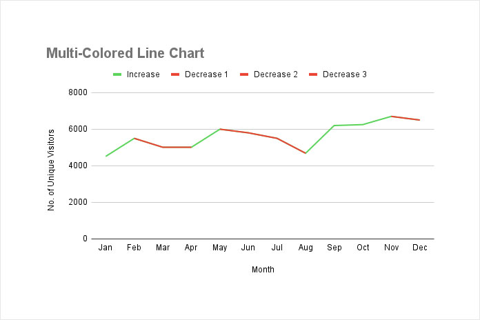
The purpose of multi-colored line charts is to differentiate between increasing and decreasing trends in data. By using two colors—green for upward trends and red for downward trends—these charts make it easy to interpret data changes at a glance.
This approach is especially useful for highlighting performance metrics, stock price movements, or any dataset where shifts in direction are significant.
Sample Data
The sample data in the range A1:B13 consists of monthly website traffic for a blog in 2024. Column A contains the month names, and column B contains the number of unique visitors each month.
I suggest using the label “Increase” for the y-axis title in cell B1. This will ensure that the legend shows “Increase” for the upward trend in the multi-colored line chart, as intended.
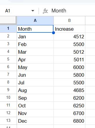
Make sure there are no empty cells in the range. Empty cells may cause errors when creating the helper columns.
Formula to Automate Multi-Colored Line Charts
In cell C2, enter the following formula:
=ArrayFormula(LET(
   data, B2:B13,
   top, MAP(data, LAMBDA(val, IF(val>IF(ISBLANK(OFFSET(val, 1, 0)), val, OFFSET(val, 1, 0)), val,))),
   bottom, MAP(data, LAMBDA(val, IF(val<IF(ISTEXT(OFFSET(val, -1, 0)), val, OFFSET(val, -1, 0)), val,))),
   top_s, (LEN(top)>0)*(LEN(bottom)=0),
   top_e, (LEN(top)=0)*(LEN(bottom)>0),
   top_r, TOCOL(IF(top_s, ROW(data),), 1),
   bottom_r, TOCOL(IF(top_e, ROW(data),), 1),
   TRANSPOSE(MAP(top_r, bottom_r, LAMBDA(x, y, TOROW(IF(ISBETWEEN(ROW(data), x, y), data,)))))
))
When you use this formula, simply replace B2:B13 with the y-axis range. The formula will generate helper columns for creating a multi-colored line chart.
For our sample data, this will populate data in three columns in the range C2:E13.
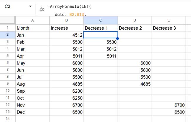
Enter headers for these columns such as “Decrease 1”, “Decrease 2”, and “Decrease 3” in C1:E1. If you have more or fewer columns, adjust the titles accordingly, starting from “Decrease 1” and continuing in sequence.
Creating Multi-Colored Line Charts
Once you have used the formula to successfully generate the helper columns, creating the multi-colored line chart is easy:
- Select A1:E13 (all data with the helper columns).
- Click Insert > Chart.
- This will most likely insert a line chart. If not, in the chart editor panel (double-click if it’s not already open), select Line chart under the Chart Type. You shouldn’t select Smooth Line Chart.
- Navigate to the Customize tab of the chart editor panel.
- Click Series.
- Select Increase and set the color to green.
- Select Decrease 1, Decrease 2, Decrease 3 one by one and set their colors to red.
Your multi-colored line chart is now ready.
Formula Explanation
Here’s how the formula automatically creates helper columns for the multi-colored line chart:
- top:
MAP(data, LAMBDA(val, IF(val>IF(ISBLANK(OFFSET(val, 1, 0)), val, OFFSET(val, 1, 0)), val,)))
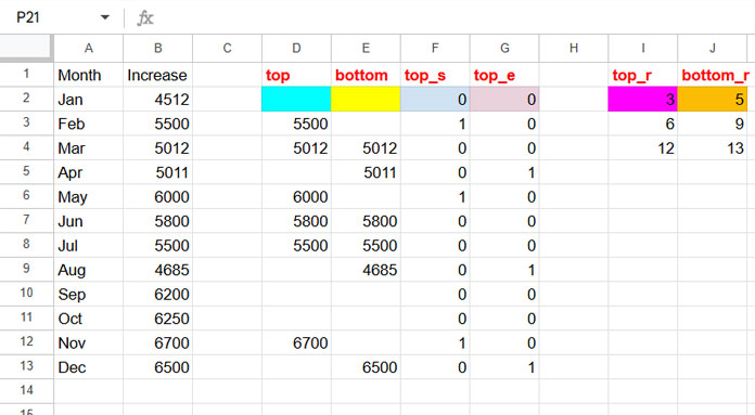
This part of the formula evaluates each value in the range B2:B16 and outputs it only if it is greater than the value directly below it. If the cell below is blank (specifically in the last row), it compares the value with itself. This helps to highlight values that are peaks or greater than the subsequent value in the column, which is useful for identifying decreasing points or plateaus in the data.
- bottom:
MAP(data, LAMBDA(val, IF(val<IF(ISTEXT(OFFSET(val, -1, 0)), val, OFFSET(val, -1, 0)), val,)))
This formula compares each cell in the range B2:B16 with the cell directly above it. If the current cell is smaller than the cell above, it returns the value in the current cell. Otherwise, it returns an empty value. If the cell above contains text (which applies to the first row), it compares the value in the current cell with itself.
- top_s:
(LEN(top)>0)*(LEN(bottom)=0)
Returns 1 for the top value of each segment of the ‘top’, otherwise 0.
- top_e:
(LEN(top)=0)*(LEN(bottom)>0)
Returns 1 for the bottom value of each segment of the ‘bottom’, otherwise 0.
- top_r:
TOCOL(IF(top_s, ROW(data),), 1)
Populates row numbers corresponding to the values 1 in ‘top_s’.
- bottom_r:
TOCOL(IF(top_e, ROW(data),), 1)
Populates row numbers corresponding to the values 1 in ‘top_e’.
TRANSPOSE(MAP(top_r, bottom_r, LAMBDA(x, y, TOROW(IF(ISBETWEEN(ROW(data), x, y), data,))))))
The final formula filters data in B2:B16 between each top_r and bottom_r and returns them in multiple columns.
This advanced formula is the core of automating multi-colored line charts in Google Sheets.
