


")


")

")
")
 in Excel & Google Sheets")


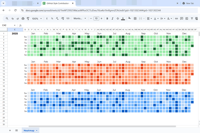
A GitHub profile tells a story without using words. That grid of green squares instantly shows consistency, gaps, and momentum across an entire year. It’s compact, intuitive, and surprisingly powerful.
In this guide, we’ll recreate that same experience by building a GitHub activity heatmap in Google Sheets—complete with correct week alignment, dynamic month labels, and a clean, GitHub-like layout. You’ll also find a downloadable template at the end.
Let’s build it step by step.
What is a GitHub activity heatmap?
A GitHub activity heatmap is a calendar-based visualization where activity intensity is shown using color.
- Horizontal (X) axis: Weeks of the year (up to 54)
- Vertical (Y) axis: Days of the week (Sunday to Saturday)
- Each cell: One calendar day
- Color intensity: Amount of activity on that day
Darker greens indicate higher activity, while lighter shades represent little or no activity. This format makes it easy to spot habits, streaks, and seasonal patterns at a glance.
Understanding GitHub’s calendar logic
Before jumping into formulas, it’s important to understand how GitHub structures its calendar:
- Weeks always start on Sunday
- If January 1 is not a Sunday, the calendar begins from the last Sunday of the previous year
- Month labels appear only above full weeks
- If a month starts mid-week, its label shifts to the next full week
We’ll replicate all of this logic in Google Sheets so the final result behaves just like GitHub’s.
Step 1: Preparing the raw data
You’ll need two columns:
- Date
- Value to track (sales, study hours, workouts, commits, etc.)
The date sequence must cover the entire year and, if required, start from the previous year’s last Sunday to maintain a complete week-based grid.
For example, in 2025, the sequence should start on 29-Dec-2024 because 01-Jan-2025 falls on a Wednesday, and the calendar must begin on Sunday. The sequence then ends on 31-Dec-2025.
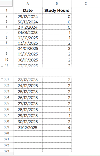
When preparing your data, handle missing values carefully. If there is no activity on a given day, enter 0 so the heatmap can reflect an explicit lack of activity. For future dates in the current year, leave the cells blank, as these dates should not contribute to the heatmap until actual data is available.
Generate the date sequence automatically
If you prefer, you can generate the date sequence dynamically for the GitHub activity heatmap Google Sheets setup.
Start by entering the field labels:
- Cell A1: Date
- Cell B1: Study Hours (or any metric you want to track)
Next, enter the calendar year (for example, 2025) in cell C1.
Now, go to cell A2 and enter the following formula:
=LET(
  dt, DATE(C1, 1, 1),
  ws, dt - WEEKDAY(dt) + 1,
  SEQUENCE(DATE(C1, 12, 31) - ws + 1, 1, ws)
)
Finally, format A2:A373 as a date by selecting Format > Number > Date.
Important note:
For any year, the date sequence will never extend beyond row 373. This safely handles leap years and includes the extra padding needed to complete full Sunday-to-Saturday weeks.
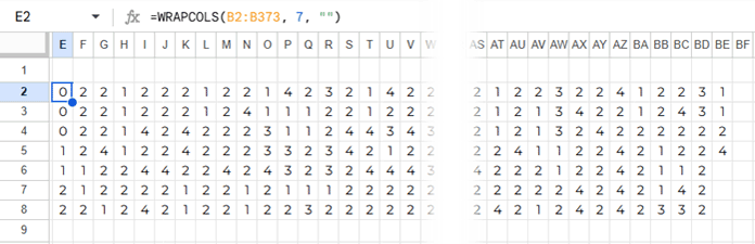
Step 2: Convert daily data into a 7 x 54 grid
GitHub’s heatmap uses 7 rows (days) and up to 54 columns (weeks).
In cell E2, enter:
=WRAPCOLS(B2:B373, 7, "")This wraps your daily values into weekly columns. Depending on the year, the final columns may be partially empty—and that’s expected.
Step 3: Format the grid into perfect squares
To make the heatmap visually accurate, each cell must be perfectly square. Resize the cells as follows:
- Columns E:BF: Set the column width to 18 px
Select columns E to BF, right-click, choose Resize columns E–BF, and enter 18 pixels. - Rows 2:8: Set the row height to 18 px
Select rows 2 to 8, right-click, choose Resize rows 2–8, and enter 18 pixels.
This ensures that each cell in the heatmap represents one day with consistent proportions, just like the GitHub activity grid.
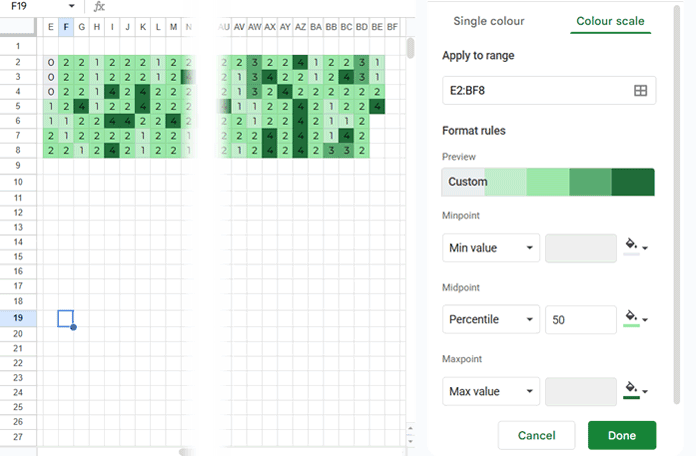
Step 4: Apply GitHub-style heatmap colors and borders
Now it’s time to apply the heatmap colors to the formatted grid.
- Select the range E2:BF8.
- Go to Format > Conditional formatting > Color scale.
Use the following color settings:
- Min value:
#EBEDF0(light gray)
Click the color bucket icon, choose Custom, and add this color using the + button. - Midpoint: Set Type to Percentile and choose the color
#9AE9A8(light green). - Max value:
#206E39(dark green).
Click Done to apply the color scale.
To achieve the clean GitHub-style grid effect:
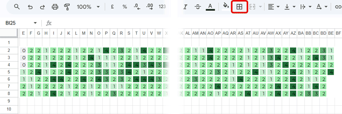
- With E2:BF8 still selected, click the Borders icon on the toolbar.
- Select the thick line style.
- Set the border color to white.
- Choose All borders.
This creates clear separation between days while preserving the classic GitHub activity heatmap look.
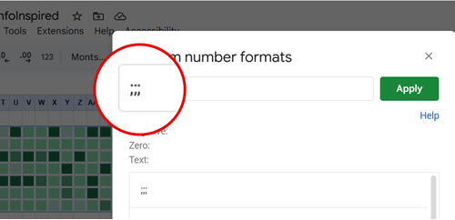
Step 5: Hide values inside cells
To complete the visual effect, you need to hide the numeric values inside the heatmap cells while keeping the colors visible.
- Select the range E2:BF8.
- Go to Format > Number > Custom number format.
- Enter the following format and click Apply:
;;;This custom format hides the numbers without affecting the conditional formatting.
At this point, your GitHub activity heatmap Google Sheets setup is fully functional and visually aligned with the GitHub-style contribution grid.
Step 6: Add dynamic month labels (GitHub-accurate)
Building the GitHub activity heatmap in Google Sheets is relatively straightforward. However, getting the month labels to align the same way GitHub does is where most implementations fall apart.
If you observe GitHub’s contribution graph closely, you’ll notice that month labels are not evenly spaced. Instead, they follow a simple visual pattern based on full weeks:
- When a month starts on a Sunday, the label appears directly above that column
- When a month starts mid-week, the label shifts to the next full week
- Month labels are never shown above partial weeks
This subtle behavior is what keeps the GitHub heatmap clean, readable, and uncluttered—and it’s also the hardest detail to reproduce correctly in Google Sheets.
Below is an example showing how the month labels align relative to the weekly grid:

Evenly spaced labels vs. GitHub-accurate labels
If you’re okay with placing month labels at fixed intervals, you can manually space them without using dynamic formulas. However, if you want your heatmap to match GitHub’s visual logic, you’ll need a dynamic approach.
To keep this guide concise and readable, the full production formula is provided in the downloadable template instead of being embedded here. You can find it in cell E1, where it generates GitHub-style dynamic month labels.
How the template handles month labels
Behind the scenes, the template uses the following logic:
- Wraps the date sequence into the same 7 x 54 grid as the heatmap
- Identifies where the first day of each month falls
- Shifts labels to the next column when a month starts mid-week
- Prevents duplicate or overlapping month names
Working with the current year only
If you’re visualizing the current year and want the heatmap to stop at today (instead of extending through December), the template already supports this behavior.
Simply adjust the date range used by the month-label logic to exclude future dates by filtering up to TODAY().
That’s it—your GitHub-style activity heatmap in Google Sheets will now display clean, accurate month labels that behave just like the real thing.
Conclusion
You now have a fully dynamic GitHub activity heatmap in Google Sheets that follows correct Sunday-based week logic, aligns month labels the same way GitHub does, and scales automatically for any year. This setup works equally well for tracking habits, productivity, fitness, or learning activity. Simply change the year in cell C1 and update the data in column B; the entire heatmap recalculates automatically.