


")


")

")
")
 in Excel & Google Sheets")


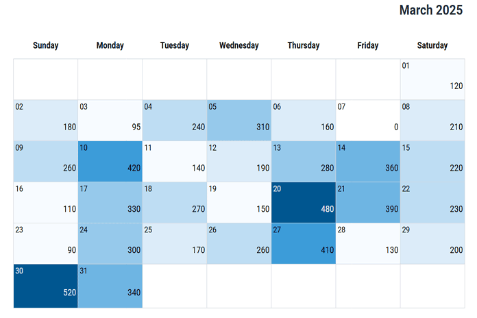
A calendar heatmap in Google Sheets is one of the most effective ways to visualize daily data patterns across a month. Instead of scanning rows of numbers, a calendar heatmap lets you spot trends, peaks, and gaps instantly—right in a familiar calendar layout.
Google Sheets does not offer a built-in calendar heatmap, and applying a standard color scale to a calendar grid often produces confusing or inaccurate results. This happens because dates are stored as numbers, which interferes with conditional formatting logic when dates and values share the same grid.
In this step-by-step tutorial, you’ll learn how to create a calendar heatmap in Google Sheets from scratch. We’ll start by building a dynamic calendar layout, then add formulas to handle dates correctly, and finally apply a smart, bucket-based conditional formatting approach that works reliably for any month and dataset.
By the end of this guide, you’ll have a fully customizable calendar heatmap in Google Sheets that you can reuse for tracking sales, expenses, habits, activity counts, or any other daily metrics.
Prefer a Ready-Made Solution?
If you don’t want to build this from scratch, you can use my Calendar Heatmap in Google Sheets (Free Template + How to Use) tutorial, which explains how to use the finished template step by step.
Now let’s procced to the steps.
Step 1: Setting Up the Control Panel
Let’s start with an empty Google Sheets file. Open a new spreadsheet using the link below (you may be asked to sign in to your Google account if you’re not already logged in): https://sheets.new
Click the File menu and choose Rename. Give the file a suitable name, such as “Sales Heatmap.”
Next, right-click the sheet tab at the bottom and rename it to “Heatmap.”
Creating the Control Panel
Now, let’s set up the control panel.
The control panel allows you to configure the calendar for a specific month and year, choose the weekday start, and optionally turn the heatmap ON or OFF.
Enter the following labels in the range J2:J5:
- Select the Month 👉
- Enter the Year 👉
- Week Starts On 👉
- Turn ON/OFF Heatmap 👉
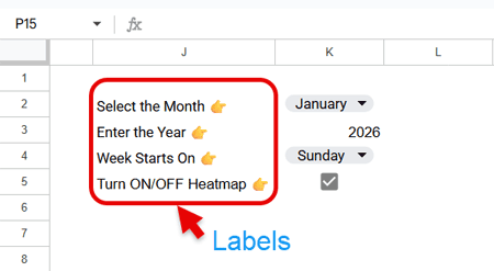
Now configure the input cells:
- Navigate to cell K2, click Insert > Drop-down, and create a drop-down list with the month names January to December.
Once created, select any month (for example, January). - Enter any year in cell K3 (for example, 2026).
- In cell K4, create another drop-down with the items Sunday and Monday.
- In cell K5, click Insert > Tick box.
Step 2: Create the Calendar for the Heatmap
The backbone of any Calendar Heatmap in Google Sheets is the calendar grid itself. In this step, we’ll build a fully dynamic calendar that automatically adjusts to the selected month, year, and week start.
We’ll create the calendar in three parts:
- Title
- Weekday names
- Calendar dates
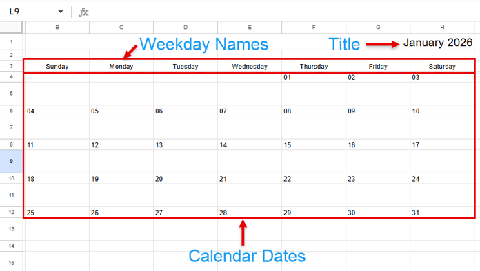
1. Create the Calendar Title
First, select the range B1:H1, then go to Format > Merge cells > Merge all.
In the merged cell, enter the following formula:
=TEXTJOIN(" ", TRUE, K2:K3)This formula returns the selected month and year in MMMM YYYY format.
Now:
- Right-align the text
- Set the font size to 17 from the toolbar
This cell serves as the calendar title.
How it works: The formula joins the month (K2) and year (K3) with a single space in between.
2. Dynamic Weekday Names for the Calendar Grid
In cell B3, enter the following formula to generate weekday names dynamically, based on whether the week starts on Sunday or Monday (as defined in the control panel), and align the output to the center.
=LET(
  s, K4,
  dwk, HSTACK("Monday","Tuesday","Wednesday","Thursday","Friday","Saturday"),
  IF(s="Sunday", HSTACK(s, dwk), HSTACK(dwk, "Sunday"))
)
Explanation:
s→ selected week start (Sunday or Monday)dwk→ weekday names from Monday to Saturday- If the week starts on Sunday, Sunday is placed before
dwk - If it starts on Monday, Sunday is appended at the end
The LET function is used to define and reuse variables cleanly.
3. Create the Calendar Dates
Creating the date grid for a Calendar Heatmap in Google Sheets requires multiple formulas so that:
- The calendar aligns correctly with the chosen weekday start
- Only valid dates for the selected month are shown
- Extra cells remain blank (important so heatmap colors don’t leak into unused cells)
Below are the required formulas.
Cell B4
=ARRAYFORMULA(
  LET(
    sdt, DATE(K3, MONTH(K2&1), 1),
    wk, SEQUENCE(1, 7, sdt - WEEKDAY(sdt, IF(K4="Sunday", 1, 2)) + 1),
    IF(wk < sdt, , wk)
  )
)
Then:
- Select B4:H4
- Go to Format > Number > Custom number format
- Enter
DDand click Apply - Left-align the dates
Explanation:
sdt→ first date of the selected month and yearwk→ Generates a sequence of seven dates representing the first visible week of the calendar, aligned to the chosen week start (Sunday or Monday)WEEKDAYlogic → Shifts the starting date backward so the row begins on the correct weekday, even if that date falls in the previous monthIFcondition → Removes dates that fall in the previous month by leaving those cells blank
This ensures that the calendar always starts on the correct weekday while displaying only valid dates for the selected month.
Cell B6
=SEQUENCE(1, 7, H4 + 1)This returns the next seven dates, starting from the last date in the previous row.
Now:
- Select B4:H4
- Click the Paint format icon
- Apply it to B6:H6
Use the same formatting for all subsequent date rows.
Cell B8
=SEQUENCE(1, 7, H6 + 1)Returns the next seven dates from the previous row.
Cell B10
=SEQUENCE(1, 7, H8 + 1)Returns the next seven dates from the previous row.
Cell B12
=ARRAYFORMULA(
  LET(
    sdt, DATE($K$3, MONTH($K$2&1), 1),
    wk, SEQUENCE(1, 7, H10 + 1),
    IFERROR(IF(EOMONTH(wk, -1) + 1 = sdt, wk, ))
  )
)
This generates seven dates from the previous row and only keeps dates that belong to the selected month. All others are left blank.
Cell B14
=ARRAYFORMULA(
  LET(
    sdt, DATE($K$3, MONTH($K$2&1), 1),
    wk, SEQUENCE(1, 7, H12 + 1),
    IFERROR(IF(EOMONTH(wk, -1) + 1 = sdt, wk, ))
  )
)
This formula works the same way as the previous one, ensuring no extra dates appear beyond the selected month.
Adjust Row Height and Column Width
Once the calendar grid is complete:
- Right-click on row 5
- Select Resize row
- Enter 46
Apply the same row height to:
- Rows 7, 9, 11, 13, and 15
Next, adjust the column width:
- Select columns B:H
- Right-click on any selected column header
- Choose Resize columns B–H
- Enter 126
This combination of row height and column width works well to display the entire Calendar Heatmap in Google Sheets on a single screen.
A calendar heatmap should ideally be visible within one sheet to clearly identify daily data patterns across the month.
Step 3: Cleaning the Grid Area
Start by removing the default gridlines. Go to View and uncheck Show > Gridlines.
Next, select the range B4:H15. From the Borders icon in the toolbar, apply a light outer border, followed by vertical borders to clearly separate each day in the calendar.
To visually distinguish each week, select rows 5, 7, 9, 11, and 13 one at a time and apply a bottom border to each.
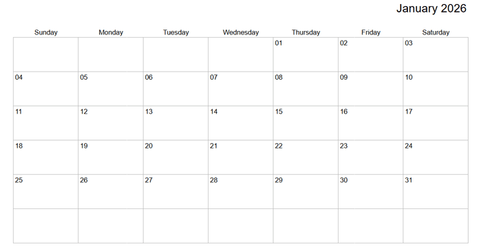
These small formatting changes clean up the grid and make the calendar easier to read—especially once the heatmap colors are applied.
Step 4: The Smart Bucket Concept for a Calendar Heatmap
Google Sheets does not provide a built-in calendar heatmap. While it does offer a color scale (heatmap), that feature cannot be used reliably in a calendar layout.
The reason is technical: dates in Google Sheets are stored as numbers. When a color scale is applied to a calendar grid, the formatting affects not only the daily values but also the date cells themselves. As a result, dates and data values are combined into a single numeric scale, producing incorrect and misleading colors.
Another limitation is the number of shades. A calendar month can contain up to 31 days, but not every month has the same number of days or the same amount of data. Applying dozens of distinct shades through conditional formatting is neither practical nor consistent. In months with fewer days or sparse data, the color scale becomes compressed and loses meaning.
To address these issues, this calendar heatmap uses smart buckets instead of a continuous color scale.
Rather than assigning a unique shade to every possible value, values are grouped into seven clearly defined buckets. Each bucket represents a meaningful range of values, ensuring consistent and predictable coloring regardless of month length or data density.
The scale is also split at zero:
- One set of buckets for positive values
- Another set for negative values
This creates a two-sided calendar heatmap, allowing positive and negative values to be highlighted independently—without interfering with the date structure of the calendar.
By using bucket-based conditional formatting, the heatmap remains accurate and stable across different months.
Step 5: Buckets for Positive Values
To calculate bucket boundaries, we’ll use a helper range.
Navigate to column N and enter the following formula in cell N2. Don’t worry if it initially returns #N/A errors—these will disappear once the calendar contains meaningful data.
=ARRAYFORMULA(
  LET(
    data, TOCOL(VSTACK(B5:H5,B7:H7,B9:H9,B11:H11,B13:H13,B15:H15),1),
    minValue, MIN(FILTER(data, data>0)),
    maxValue, MAX(FILTER(data, data>0)),
    bktCount, 7,
    minValue + SEQUENCE(bktCount) * (maxValue - minValue) / bktCount
  )
)
How the smart bucket formula works
data→ Combines all value cells in the calendar grid (excluding dates) into a single column, ignoring blanksminValue→ Returns the minimum positive value (excluding zero)maxValue→ Returns the maximum positive valuebktCount→ Set to7; this is the sweet spot for a readable calendar heatmap in Google Sheets- Bucket calculation → Creates evenly spaced bucket boundaries between the minimum and maximum values
Step 6: Buckets for Negative Values
Next, we create buckets for negative values. Enter the following formula in cell O2:
=ARRAYFORMULA(
  LET(
    data, TOCOL(VSTACK(B5:H5,B7:H7,B9:H9,B11:H11,B13:H13,B15:H15),1),
    minValue, MIN(FILTER(data, data<0)),
    maxValue, MAX(FILTER(data, data<0)),
    bktCount, 7,
    minValue + SEQUENCE(bktCount) * (maxValue - minValue) / bktCount
  )
)
This formula is identical to the one used for positive values, except the data is filtered to include only negative values, excluding positive numbers and zero.
Step 7: Apply Conditional Formatting for Positive Values
Open the conditional formatting panel by going to Format > Conditional formatting.
Set the following options:
- Apply to range:
B4:H15 - Format rules:
Custom formula is
Add the rules one by one, using the corresponding fill color and text color listed below. There are seven rules in total for positive values.
Positive value rules
| Formula | Fill Color | Text Color |
|---|---|---|
=LET(dt, OFFSET(B4, MOD(ROW(B5), 2), 0), AND(dt>0, dt<=$N$2)) | #F7FBFF | Default |
=LET(dt, OFFSET(B4, MOD(ROW(B5), 2), 0), AND(dt>$N$2, dt<=$N$3)) | #DCECF9 | Default |
=LET(dt, OFFSET(B4, MOD(ROW(B5), 2), 0), AND(dt>$N$3, dt<=$N$4)) | #BEDDF3 | Default |
=LET(dt, OFFSET(B4, MOD(ROW(B5), 2), 0), AND(dt>$N$4, dt<=$N$5)) | #96C9EB | Default |
=LET(dt, OFFSET(B4, MOD(ROW(B5), 2), 0), AND(dt>$N$5, dt<=$N$6)) | #6EB5E3 | Default |
=LET(dt, OFFSET(B4, MOD(ROW(B5), 2), 0), AND(dt>$N$6, dt<=$N$7)) | #3C9CD9 | Default |
=LET(dt, OFFSET(B4, MOD(ROW(B5), 2), 0), AND(dt>0, dt>$N$7)) | #005690 | White |
After adding all rules, carefully double-check that:
- Each formula references the correct bucket cell
- The rules are in the correct order
- Fill and text colors match the table
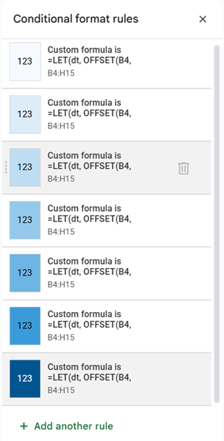
These rules are the core of the heatmap, and even a small copy-paste mistake can lead to incorrect coloring.
How the formulas work:
Each rule tests whether a value in the calendar grid falls within a specific positive bucket range and applies the corresponding color.
Why OFFSET + MOD(ROW()) Is Used in the Conditional Formatting Rules
At first glance, the conditional formatting formulas may look confusing—especially the use of OFFSET() combined with MOD(ROW(), 2). This pattern is intentional and solves a specific problem in a calendar layout.
In this calendar, dates and values occupy different rows:
- Date numbers appear in rows 4, 6, 8, 10, 12, and 14
- Data values appear directly below each date, in rows 5, 7, 9, 11, 13, and 15
However, conditional formatting is applied to the entire range B4:H15. When Google Sheets evaluates a rule, it does so cell by cell, without knowing whether a cell contains a date or a value.
To ensure the formatting is based only on the data values, each rule dynamically references the value cell associated with the current date cell.
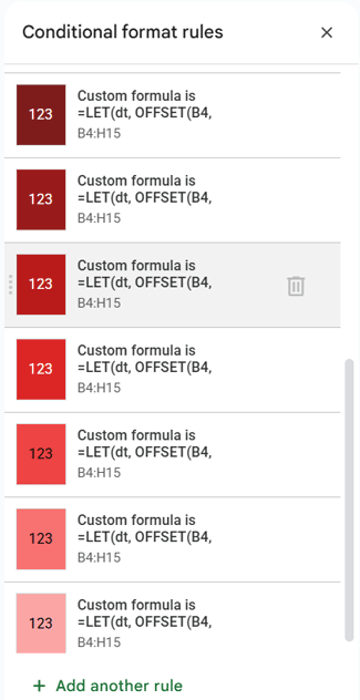
Step 8: Apply Conditional Formatting for Negative Values
Repeat the same process to format negative values, this time using the bucket boundaries in column O.
Use the same Apply to range (B4:H15) and Custom formula is option, then add the following seven rules.
Negative value rules
| Formula | Fill Color | Text Color |
|---|---|---|
=LET(dt, OFFSET(B4, MOD(ROW(B5), 2), 0), AND(dt<0, dt<=$O$2)) | #7F1D1D | White |
=LET(dt, OFFSET(B4, MOD(ROW(B5), 2), 0), AND(dt>$O$2, dt<=$O$3)) | #991B1B | White |
=LET(dt, OFFSET(B4, MOD(ROW(B5), 2), 0), AND(dt>$O$3, dt<=$O$4)) | #B91C1C | White |
=LET(dt, OFFSET(B4, MOD(ROW(B5), 2), 0), AND(dt>$O$4, dt<=$O$5)) | #DC2626 | White |
=LET(dt, OFFSET(B4, MOD(ROW(B5), 2), 0), AND(dt>$O$5, dt<=$O$6)) | #EF4444 | Default |
=LET(dt, OFFSET(B4, MOD(ROW(B5), 2), 0), AND(dt>$O$6, dt<=$O$7)) | #F87171 | Default |
=LET(dt, OFFSET(B4, MOD(ROW(B5), 2), 0), AND(dt<0, dt>$O$7)) | #FCA5A5 | Default |
Once again, verify that every rule is added correctly with the intended colors. Any mistake in the formulas or bucket references can cause the calendar heatmap to display inaccurate results.
Step 9: Turn the Heatmap ON / OFF
Finally, add one more conditional formatting rule to control the visibility of the heatmap.
Create a new rule with the following settings:
- Custom formula is:
=$K$5=FALSE - Fill color: White
- Text color: Default
After adding the rule, drag it to the top of the conditional formatting rule list.
When the checkbox in the control panel (cell K5) is unchecked, this rule overrides all other rules and effectively turns the heatmap off. Checking the box turns the heatmap back on.
This simple toggle allows you to show or hide the heatmap without modifying or deleting any conditional formatting rules.
Conclusion
You’ve now learned how to create a calendar heatmap in Google Sheets using a robust, bucket-based approach that avoids the limitations of built-in color scales. This method ensures accurate, consistent, and visually meaningful results—regardless of the month length or data distribution.
With this setup in place, you can start entering values directly into the calendar grid or pull data dynamically from another table using formulas. The result is a reusable and flexible calendar heatmap in Google Sheets that makes daily patterns easy to interpret at a glance.
For step-by-step usage instructions and a ready-to-use file, see the companion post: Calendar Heatmap in Google Sheets (Free Template + How to Use).