Conditional formatting with a color scale in Google Sheets lets you visually represent data ranges using gradient colors. This is especially helpful for spotting trends, identifying outliers, or making large sets of numbers easier to interpret at a glance.
For example, if you have a list of student scores, you can highlight the range so higher marks appear in darker shades of red, and lower marks in lighter shades—helping you identify top performers instantly.
Color scales work only with numbers, dates, or timestamps. If your data includes text mixed with numbers, you’ll need to extract the numbers first using functions like REGEXEXTRACT or REGEXREPLACE.
Google Sheets offers four types of color scale rules:
- Min and Max
- Number
- Percentile
- Percent
Let’s walk through how each one works.
1. Min and Max Color Scale in Google Sheets
This rule automatically assigns colors based on the lowest and highest values in a range—you can’t manually define them.
Steps:
- Select your data range (e.g.,
B3:B14). - Go to Format > Conditional formatting.
- Under the Color scale tab, keep the default settings.
By default:
- The maximum value gets a dark green color.
- The minimum value gets a white color.
You can change the gradient from green-to-white to any custom colors using the “Preview” section.
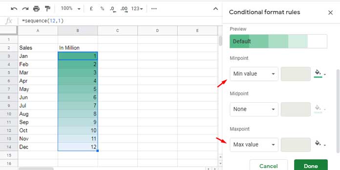
Note: Midpoint value customization (Number, Percentile, or Percent) is not available in this rule. The midpoint position is automatically calculated based on the min and max values.
2. Number Color Scale in Google Sheets
Use this option when you want to assign specific Minpoint and Maxpoint values manually.
Example: Let’s say you want to apply a gradient to values between 3.75 and 9.25.
- Minpoint: 3.75
- Maxpoint: 9.25
Behavior of Out-of-Range Values in Number Color Scale
- Values below 3.75 will be assigned the Minpoint color (i.e., the color used for the minimum).
- Values above 9.25 will be assigned the Maxpoint color (i.e., the color used for the maximum).
- Values in between will receive a gradient color based on their relative position between the Minpoint and Maxpoint.
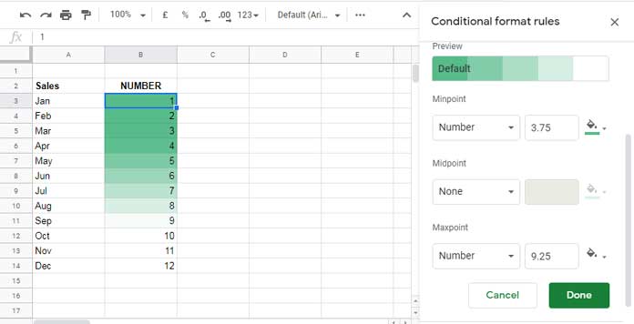
This gives you more control over how data is visualized.
Note: The midpoint setting is optional but available in this rule.
3. Percentile Color Scale in Google Sheets
This scale applies gradient colors based on percentiles within the data—perfect for statistical comparisons. A percentile represents the value below which a given percentage of data falls. For example, the 25th percentile marks the point below which 25% of the values lie.
Example settings:
- Minpoint: 25
- Maxpoint: 75
Google Sheets will automatically assign gradient colors based on these percentile thresholds.
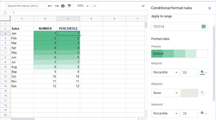
Note: This rule supports midpoint percentile configuration.
To calculate percentiles in your sheet:
- 25% mark:
=PERCENTILE(B3:B14, 0.25) - 75% mark:
=PERCENTILE(B3:B14, 0.75)
4. Percent Color Scale in Google Sheets
The Percent rule in Google Sheets (when Min, Midpoint, and Max types are set to “Percent”) applies gradient colors based on specific percentages of the data range’s numeric span, not based on the data’s rank or distribution.
To map the Min, Midpoint, and Max colors to the actual minimum, midpoint, and maximum values in your dataset, set:
- Minpoint = 0
- Midpoint = 50
- Maxpoint = 100
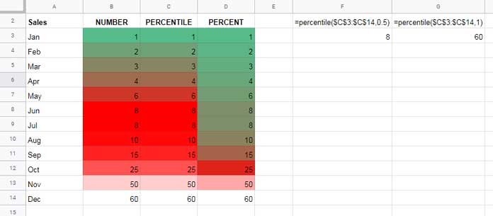
Here’s how it works:
- Google Sheets identifies the minimum and maximum numerical values in the selected range.
- It calculates a midpoint as the arithmetic mean between the min and max values.
- The selected colors are mapped as follows:
- The Min color is applied to the absolute minimum value
- The Midpoint color is applied to the calculated midpoint
- The Max color is applied to the absolute maximum value
All other values are colored using linear interpolation between these anchor points.
Given the values: 1, 2, 3, 4, 6, 8, 8, 10, 15, 25, 50, 60
- Min value = 1 (Green)
- Max value = 60 (White)
- Midpoint = (1 + 60) / 2 = 30.5 (Red)
So:
- Values near 1 will be shaded green
- Values around 30.5 will be red
- Values approaching 60 will be white
Because most values are below 30.5, you’ll see more shades of green and red than white—reflecting the actual skew in the data distribution.
Using Cell References for Min, Mid, and Max Points
Instead of typing values directly into the conditional formatting panel, you can reference cells.
Example:
- Enter
3.75in cellF1and9.25in cellF2. - In the formatting panel:
- Set Minpoint to
=$F$1 - Set Maxpoint to
=$F$2
- Set Minpoint to
This makes your formatting dynamic and easier to update.
Practical Use Cases for Color Scales in Google Sheets
Here are a few real-world scenarios where color scales can make your data more actionable:
- Education: Highlight student scores or attendance patterns.
- Sales: Visualize revenue by region, salesperson, or product.
- Inventory: Track stock levels using green-to-red indicators.
- Project Management: Show task urgency or completion percentages.
- Finance: Flag abnormal variances or financial ratios visually.
Color scales make it easier to spot patterns, trends, and outliers at a glance—without needing to create charts.
Conclusion
Color scales in Google Sheets provide a powerful way to visualize data using gradients—whether you’re working with raw values, fixed thresholds, or statistical distributions like percentiles. By choosing the right type of scale, you can quickly uncover trends, spot outliers, and make your data more intuitive to analyze.
If you want to explore more conditional formatting techniques—ranging from simple highlights to advanced, formula-driven rules—check out: The Ultimate Guide to Conditional Formatting in Google Sheets


