


")


")

")
")
 in Excel & Google Sheets")


This post is a focused deep dive into the design logic behind an Excel calendar heatmap—explaining how dates, weekdays, and heatmap coloring work together to create a fully dynamic, reliable yearly view.
This is not a formula memorization guide. Instead, it explains the why behind the formulas: the logic that ensures correct weekday alignment, accurate date generation, and meaningful color intensity even when data is sparse.
If you’re using the Perpetual Calendar Heatmap template—or building your own—understanding this Excel calendar heatmap design logic will help you customize the model confidently and reuse the same ideas in real-world dashboards.
If you’re looking for the ready-made template and step-by-step usage instructions, start with the main Perpetual Calendar Heatmap in Excel tutorial.
This design relies on modern Excel features such as dynamic arrays, so it works in Excel 365, Excel 2021, and later versions.

Why Understanding Excel Calendar Heatmap Design Logic Matters
A calendar heatmap is one of the most effective ways to visualize daily data across an entire year in Excel. When designed properly, it instantly reveals seasonality, peaks, gaps, and behavioral patterns.
However, many Excel heatmaps fail because the underlying logic is fragile. Weekdays drift, leap years break layouts, colors lose meaning, or sparse data produces no visible heatmap at all.
This article explains the design logic that avoids those failures.
Common Design Problems with Excel Calendar Heatmaps
Before diving into the solution, it helps to understand the usual problems:
- Weekdays misalign when the year changes
- Calendars break for leap years
- Dates and values are separated instead of integrated
- Conditional formatting fails when there are very few values
- Month boundaries are visually unclear
A robust Excel calendar heatmap must solve all of these at once.
Core Structure of a Perpetual Yearly Calendar
At the heart of the heatmap is a perpetual yearly calendar that automatically adapts to:
- Any selected year
- A user-defined week start (Sunday or Monday)
The same calendar logic is reused across both heatmap modes:
- Monthly Relative (for within-month patterns) — sheet name: Monthly_Relative
- Yearly Absolute (for cross-month comparison) — sheet name: Yearly_Absolute
Supporting worksheets named Monthly_Relative (2) and Yearly_Absolute (2) simply mirror the results of their respective parent sheets. These versions are optimized for single-screen viewing and printing, without altering the underlying logic.
Weekday Alignment Logic in an Excel Calendar Heatmap
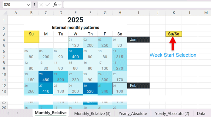
Week Start Selection
Different regions follow different week-start conventions. While Sunday is commonly used in North America, the ISO 8601 standard defines Monday as the first day of the week.
To accommodate both conventions, the calendar heatmap includes a dedicated control that allows the user to select the desired week start. Once this option is changed, the entire calendar recalculates and realigns automatically—no manual intervention is required.
The weekday headers are generated dynamically in cell B3 based on the selection made in cell K3. This same setting is also referenced when generating the dates for the first week of the year in cell B4, ensuring that weekday labels and calendar dates remain perfectly synchronized.
All of this logic is driven by the user-defined year in cell B1, allowing the calendar to adapt correctly for any year, including leap years.
This level of flexibility is a foundational aspect of robust Excel calendar heatmap design.
Weekday Offset for January
Once the week start is defined, the calendar must determine where January 1 falls within the grid.
The logic identifies the weekday of January 1 for the selected year, aligns it to the correct column based on the chosen week start, and then fills the remaining days of that week sequentially.
Any dates that belong to December of the previous year are automatically excluded. This ensures that the first visible week in the calendar always belongs to the selected year and remains correctly aligned.
The formula in cell B4 handles this alignment and exclusion logic.
Filling Dates Across the Year
Each subsequent row continues the calendar by generating the next seven dates.
Extra checks are applied near the end of the year to remove dates that spill into the following year. This ensures the calendar always represents exactly one year, no more and no less.
Month Identification and Labels
In a Perpetual Calendar Heatmap in Excel, clearly marking month boundaries is essential—but repeating month names on every row would clutter the layout and reduce readability. To avoid this, month names are displayed in column I only where a new month begins.
This approach keeps the calendar clean while still making month transitions immediately visible.
A key challenge here is that the calendar grid contains both dates and data values. Internally, Excel stores both as numbers, which means it cannot naturally distinguish a date row from a value row. Without additional logic, this can lead to incorrect or inconsistent month labels.
The solution uses the structure of the calendar itself to reliably identify date rows, detect where a new month starts, and display the month name only at that transition point. This ensures that each month is labeled once—exactly where it matters.
The result is a true yearly calendar layout where month changes are obvious, visually balanced, and free from unnecessary repetition—an important design principle behind a reliable Excel calendar heatmap.

Fetching Data into the Calendar Grid
Unlike layouts where a helper table of the same dimensions is placed alongside the calendar heatmap, this template keeps the calendar clean and self-contained. The calendar grid itself displays the heatmap, while data is fetched from a separate worksheet using XLOOKUP.
Daily values are retrieved from the Data worksheet. In the Data worksheet, users enter data in Columns A and C, while Columns K (dates) and L (values) aggregate multiple entries for the same day. Each calendar date is matched against Data!K:K, and the corresponding value from Data!L:L is returned to the calendar.
This data-fetching logic is applied systematically across the calendar. Formulas are entered in the first data row and copied to every alternate row, ensuring that all weeks throughout the year are populated automatically.

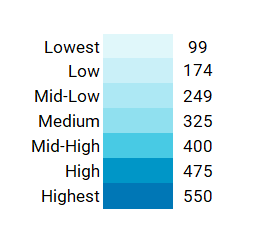
Smart Buckets: The Key to Reliable Heatmap Coloring
One of the most important elements of Excel calendar heatmap design logic is smart bucketing.
Default color scales often fail when:
- Only a few values exist
- All values are similar
- There is only a single non-zero value
Smart buckets solve this by explicitly defining how values map to colors.
Two bucket strategies are used:
- Yearly Absolute buckets
- Monthly Relative buckets
Yearly Absolute Buckets
Yearly Absolute buckets treat the entire year as one dataset.
The logic:
- Identify the minimum and maximum non-zero values for the year
- Divide the range into seven evenly spaced levels
- Apply the same thresholds across all months
This approach preserves true magnitude comparison across the entire year, making it ideal for spotting seasonality and extreme values.
Monthly Relative Buckets
Monthly Relative buckets apply the same seven-level logic, but independently for each month.
Each month generates its own bucket thresholds, allowing color intensity to represent relative activity within that month.
This makes internal monthly patterns visible even when one month’s values are much smaller or larger than another’s.

When to Use Each Bucket Strategy
- Yearly Absolute → Best for comparing values across months and identifying seasonal trends
- Monthly Relative → Best for analyzing day-to-day variation within a month
Both use the same underlying logic—the difference is scope.
Conditional Formatting Design Logic
Two types of conditional formatting rules bring the calendar heatmap to life:
- Month separators, applied as borders to clearly divide one month from the next
- Color grading, driven by the smart bucket logic
Month Separator Rules
Each month is visually separated using a bottom border applied through conditional formatting.
This approach keeps the calendar layout intact while clearly marking month boundaries—without inserting extra rows or manual formatting.
The same border logic is used in both Monthly_Relative and Yearly_Absolute worksheets, ensuring a consistent calendar structure across all views.
Color Grading Logic
A seven-level color scale is used to represent magnitude, progressing from light to dark.
This palette (referred to as Arctic Ocean) ensures:
- Clear visual contrast between low and high values
- Month separator borders remain visible even at the darkest color level
- Consistent interpretation across the calendar
Yearly_Absolute Color Logic
In Yearly_Absolute, all calendar cells are evaluated against one unified bucket system created from the minimum and maximum values for the entire year.
Each day’s value is classified into one of seven levels:
- Lowest
- Low
- Mid-Low
- Medium
- Mid-High
- High
- Highest
The same thresholds apply across every month, making this view ideal for identifying seasonality, long-term trends, and cross-month comparisons.
Monthly_Relative Color Logic
In the Monthly_Relative worksheet, the color logic is the same as Yearly_Absolute—but the scope changes.
Each month generates its own set of seven buckets, calculated only from values within that month. Across the year, this results in 12 independent bucket sets, one for each month.
When conditional formatting is applied, Excel first identifies the month of the current date, then evaluates the value against that month’s seven bucket thresholds.
This ensures that:
- Color intensity is relative within each month
- Smaller ranges are still visually meaningful
- Internal monthly patterns stand out clearly
Final Thoughts on Excel Calendar Heatmap Design Logic
A reliable Excel calendar heatmap is not about clever formulas—it’s about sound design logic.
By combining correct date alignment, smart bucketing, and disciplined conditional formatting, the Perpetual Calendar Heatmap delivers a true, fully dynamic yearly view that works for any year and any dataset.
Once you understand this Excel calendar heatmap design logic, you can confidently adapt it, extend it, or build your own versions from scratch.
For the complete template and usage guide, see the main Perpetual Calendar Heatmap in Excel tutorial.