


")


")

")
")
 in Excel & Google Sheets")


Excel doesn’t have a native calendar heatmap feature. When you try to visualize daily values across an entire year, most workarounds break down at the point where two essentials need to come together: actual calendar dates and the data you want to analyze.
A proper Calendar Heatmap in Excel places values directly beneath each date, aligns weekdays correctly for any year, and uses color intensity to represent magnitude. It avoids the common compromise of showing a static yearly calendar on one side and a disconnected heatmap on the other.
This is exactly what the Perpetual Calendar Heatmap in Excel is designed to solve. It creates a true, fully dynamic yearly calendar that automatically aligns weekdays, clearly separates months, and highlights values using a smart bucket-based color system.
Two Ways to Read the Same Year
The template includes two calendar heatmaps, each answering a different analytical question:
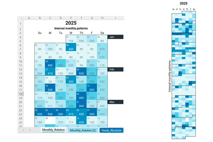
1. Internal monthly patterns
Each month is color-scaled independently, so values are compared only within that month.
This view is ideal for spotting peaks and valleys inside a month, such as:
“What was my busiest day in January?”
2. Overall yearly performance
All days in the year share a single Min/Max scale.
This makes it easy to identify seasonal trends and high-activity periods, such as:
“I’m 10× more active in summer than in winter.”

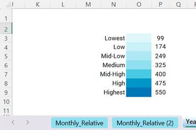
For internal monthly patterns, the template uses 12 month-specific buckets, each with 7 magnitude levels, powered by just 7 conditional formatting rules. An advanced formula assigns each date to the correct bucket for its month.
For overall yearly performance, the template uses one unified bucket system with 7 magnitude levels applied across the entire year.
Simply enter a year and choose the week start. The calendar updates automatically, pulls data from a separate table, and reflects your values instantly in both heatmaps.
Download the Fully Automatic Calendar Heatmap Template for Excel
This template works with modern versions of Excel that support dynamic arrays and functions such as LET and FILTER.
The calendar is built entirely using formulas and conditional formatting to generate the layout, populate data, and create the heatmap—no VBA or macros required.
The template is free for personal use. Redistribution, resale, or publishing it online is not permitted. See the Copyright (©) worksheet in the template for full details.
Included Worksheets
Monthly_Relative
Shows internal monthly patterns.
Dark blue indicates higher values within that month.
This is the primary worksheet where controls and logic are defined.
Monthly_Relative (2)
A mirrored copy of the Monthly_Relative worksheet with the same logic and color scaling.
Dates and data values are hidden, and row/column sizes are adjusted so the entire calendar fits on a single screen.
This sheet is intended for quick viewing and printing.
All controls remain in the original Monthly_Relative worksheet.
Yearly_Absolute
Shows overall yearly performance.
Dark blue indicates higher values across the entire year.
This is the primary worksheet for yearly comparison.
Yearly_Absolute (2)
A mirrored copy of the Yearly_Absolute worksheet with identical logic and color behavior.
Dates and data values are hidden, and the layout is optimized for single-screen viewing and printing.
All controls remain in the original Yearly_Absolute worksheet.
Data
This is the sheet where the daily data is entered.
Some parts of the sheet contain calculations and are clearly noted within the sheet itself—do not modify those sections.
Copyright
Contains copyright and usage information.
Key Features of the Calendar Heatmap in Excel
Here are the key features of the Perpetual Calendar Heatmap template:
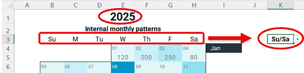
- Enter a year and select the week start (Sunday–Saturday or Monday–Sunday). The full-year calendar populates automatically.
- Each week row includes a dedicated data row for displaying values.
- Data is automatically pulled from the source table for the selected year.
- Each month is visually separated using a bottom border applied through conditional formatting.
- Once set up, the heatmap updates automatically for any year.
- To reveal internal monthly patterns, the template uses 12 month-specific buckets, each with 7 color levels, ensuring consistent interpretation within each month.
For overall yearly performance, it uses one unified bucket with 7 color levels across the entire year. - Only positive values influence heatmap highlighting.
- For both monthly internal patterns and overall yearly performance, a supporting worksheet is included for single-page printing or full-screen preview. These sheets simply mirror the original calendars with adjusted layout.
- Completely free for personal use.
How to Use the Perpetual Calendar Heatmap in Excel: Step-by-Step Guide
You don’t need to edit the heatmap manually. The calendar pulls all required data automatically from another worksheet in the same workbook.
1. Set Up the Data Worksheet
Enter your daily data in a structured format so the calendar heatmap can pull and display it automatically.
- Enter your data in the Data worksheet.
- Include at least these columns:
- Column A: Dates
- Column C: Values (quantities, counts, amounts)
- Optionally, use Column B for descriptions (item names, notes, etc.). If unused, you may hide this column. The heatmap ignores it.
- Add additional columns after Column C up to Column I as needed. Columns K and L are automated—do not modify them.
- If a date appears multiple times, the template sums the values and displays a single total in the calendar.

2. Control the Heatmap
You can control the heatmaps from the Monthly_Relative and Yearly_Absolute worksheets, depending on your requirements.
The Monthly_Relative (2) and Yearly_Absolute (2) worksheets do not include controls, as they automatically adapt to the settings of their corresponding parent worksheets.
You can control the heatmap using the following options:
- Enter the year you want to visualize in cell B1.
- Choose the week start in cell K3:
- Su/Sa
- M/Su
The calendar updates instantly. To view a different year, simply change the year value.
Important:
Apart from entering your data in the Data sheet, only modify the year (B1) and week start selector (K3).
Editing any other cells can disrupt the calendar and heatmap logic.
3. Understanding the Calendar Interface
Here’s how the calendar layout is structured and how data appears in each row.
- Every alternate row represents a week, with dates in smaller font aligned to the left.
- Rows in between display data values, centered. The heatmap highlights both dates and values, so the calendar looks continuous.
- The calendar has 108 rows, representing 54 weeks.
- January 1 automatically aligns to the correct weekday. Each month has a bottom border separator. Month names appear on the right next to the first week of the month.
- Formulas automate all elements of the Heatmap worksheet.

4. The Smart Bucket Concept
The template uses a smart bucket approach to apply colors consistently. The same underlying logic is used for both internal monthly patterns (Monthly_Relative) and overall yearly performance (Yearly_Absolute). The difference is scope: the former creates buckets per month, while the latter creates buckets for the entire year.
In the Monthly_Relative worksheet, each month’s values are divided into 7 levels, from lowest to highest, to reveal internal monthly patterns. This results in 12 separate bucket sets, one for each month, each with 7 boundaries. Conditional formatting then colors each day based on the bucket it falls into.
Because the buckets are calculated independently for each month, color intensity is month-specific. The darkest color represents the highest value within that month, not across the entire year. This makes monthly trends easy to spot, even when data ranges vary significantly from one month to another.

In Yearly_Absolute, there is only one bucket system. All values for the entire year are divided into 7 levels, from lowest to highest, and the same color scale is applied across every month.
A helper range automatically calculates all bucket boundaries.
Do not edit this helper range, as doing so will break the heatmap. You may occasionally see errors here if a month contains no data; this is expected and safe to ignore.
If you’d like to understand how this calendar works internally—covering weekday alignment, date generation, and heatmap logic—see the detailed design explanation here: Design Logic Behind the Perpetual Calendar Heatmap in Excel
Frequently Asked Questions (FAQ) About the Calendar Heatmap in Excel
Is this a chart?
No. This is a worksheet-based Calendar Heatmap in Excel, built entirely using formulas and conditional formatting.
Do I need VBA or macros?
No. The template works completely without VBA or macros.
Can I use zero or negative values?
Only positive values are highlighted in the heatmap. Zero or negative values are ignored.
Can I customize the colors?
Yes. You can modify the color scale using conditional formatting. When customizing, ensure the darkest color does not obscure the month separator borders.
The template currently uses the “Arctic Ocean” color scale. For example, you could switch to a sunset-style palette such as:
#FB8C00#FFA726#FFD54F#FFE082#FFF176#FFF9C4#FFFDE7
Do this carefully. Make sure the darkest color in your new palette is assigned to the highest bucket. Using an overly dark shade can hide month borders and affect readability.
Will this work for future years?
Yes. Enter any year—past or future—and the calendar updates automatically.
What Excel versions are supported?
The template works with modern Excel versions that support dynamic arrays, such as Excel 365 and Excel 2021. Older versions may not support all formulas.
Conclusion
The Perpetual Calendar Heatmap in Excel makes it easy to visualize daily data across an entire year in a true calendar layout. By simply entering your data, selecting a year, and choosing the week start, the calendar updates automatically and stays perfectly aligned.
With support for both internal monthly patterns and overall yearly performance, the template helps you uncover trends, seasonality, and activity peaks at a glance. All of this is achieved using formulas and conditional formatting—no VBA, no macros, and no manual adjustments—making it a reliable and flexible solution for long-term use.