How many of you know about Radar Charts? Also, do you know how to create a Radar Chart in Google Sheets? I’m answering both these questions in this tutorial.
As a side note, the Radar Chart is also known as Spider Chart in Google Sheets.
What is Radar Chart in Google Sheets?
A Radar Chart is a simple two-dimensional chart.
You can arrange data in columns or rows in a worksheet to plot in a radar chart.
In the Radar chart, you can show one or more variables or multivariate data with one spoke for each variable.
Data points are drawn clockwise around the chart.
Purpose of Radar Chart or Radar Graph
You can use Google Sheets Radar Chart or Spider Chart similar to Column Chart for comparison.
When the number of variables is large, use a Radar chart, which offers a clutter-free data visualization experience.
In my opinion, Radar Chart’s readability level is far behind the Column Chart.
How to Create a Radar Chart in Google Sheets
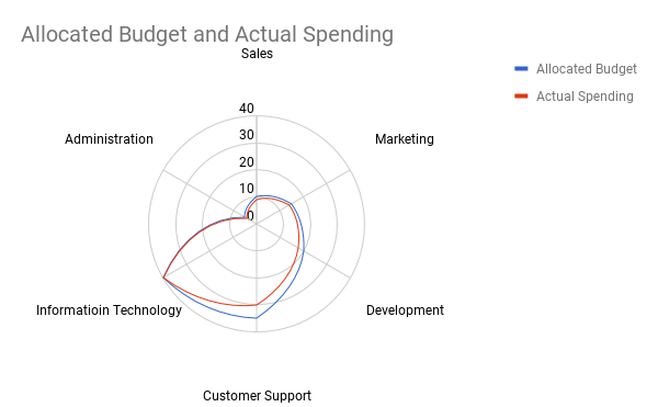
With the help of the below sample data, let’s compare my monthly allocated budget and actual spending using the Radar Chart in a Google Doc Spreadsheet.
Sample Data for Radar Chart Creation:
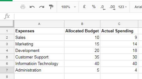
Steps to Create Radar Chart:
1. Select the data.
2. Go to the Insert menu and click on Chart.
3. Select the chart Radar Chart.
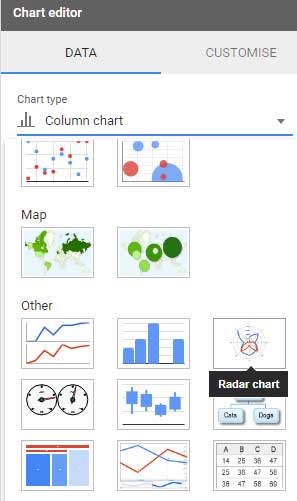
4. It’ll insert the RADAR chart as below.
Note:
I’ve found that Google Sheets behave abnormally in chart selection.
When you click on Radar Chart, Google Sheets may insert Histogram Chart, its predecessor, in the chart editor.
I have got this issue with my Google Sheets. If you face such an issue, click on Gauge Chart, its successor. It may insert the proper Radar Chart.
Update:- It seems the said problem no more exists.
Here is my finished Radar Chart.
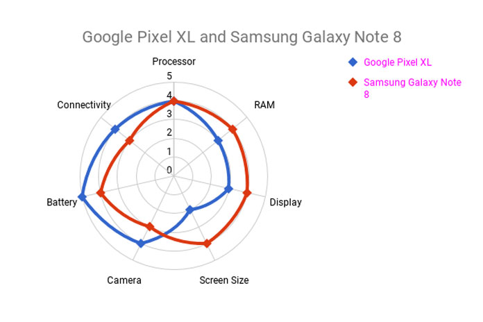
Here is one more Radar Chart where I compare some of the features of two trendy smartphones. See that below.
Please note that this comparison has nothing to do with the original phone’s features. It’s just sample data.
I hope you could clearly understand how to create a Radar Chart in Google Sheets.
Any doubt, please drop in comments.
Resources
- How to Format Data to Make Charts in Google Sheets.
- How to Change Data Point Colors in Charts in Google Sheets.
- Choose Suitable Chart for Your Spreadsheet Data – How To.
- How to Get Dynamic Range in Charts in Google Sheets.
- How to Create a Multi-category Chart in Google Sheets.
- Enabling the Horizontal Axis (Vertical) Gridlines in Charts in Google Sheets.
- How to Include Filtered Rows in a Chart in Google Sheets.



Hi, how I could show the value of series for all axles? On Radar from Sheets, you can see just the values in one axle.