


In this tutorial, let me explain how to create a Pivot Table report in Google Sheets. It contains all the necessary info to master it.
You can quickly summarize data using Pivot Table in Google Sheets.
Pivot Table and Query are the best tools in this spreadsheet application to group and aggregate data. The former is a menu command, whereas the latter is a native worksheet function.
You can’t be a Spreadsheet pro without knowing how to create a Pivot Table in Google Sheets.
Whether you use Microsoft Excel or Google Doc Spreadsheet, Pivot Table is always there to mesmerize you.
Purpose of Creating Pivot Table Report in Google Sheets
The main purpose of the Pivot Table is to analyze large data sets in Google Sheets.
You can summarize your data dynamically (the report will update when you edit your source data) and perform various calculations without using any formulas manually. All these within a few clicks.
Sometimes the built-in aggregation functions in your Pivot Table may be unable to do a specific task. In that case, you can use custom formulas in Pivot Table. For that, use the calculated fields.
Using Pivot Table to Summarize Data in Google Sheets
To understand the use of Pivot Table reports and how to use it to summarize data in Google Sheets, we need to experiment with some sorts of sample data.
I know you don’t have enough time to spend on creating sample data. So we can use the sample data provided by Google for experiment purposes.
You can follow the below link for the sample data to create a Pivot Table report in Google Sheets. Make sure that you have already signed into your Google Drive.
Follow the above button to open the spreadsheet. Then click on the button labeled “Use Template.” It will open the sample Pivot Table report data in a new Spreadsheet in Google Docs.
Just try to understand the data first. It is a list of students in a college.
The data is in columns, and the column labels are Student Name, Gender, Class Level, Home State, Major, and Extracurricular Activity.
You can use some of these column labels to summarize your data.
We will take two column labels for our example Pivot Table report: “Class Level” and “Major.”
You can find subjects like Physics, Math, etc., under “Major.”
Under “Class Level,” you can see the hierarchy (grade) like Senior, Junior, Freshman, etc.
We will summarize this data to find the number of Senior, Junior, etc., students in each subject.
Steps to Create a Pivot Table Report in Google Sheets
First of all, select the entire data. You can follow different methods to do it in Google Sheets.
The ideal method is as follows in Windows. Go to the first cell and apply Ctrl+Shift+ Right Arrow. It will select the first row of your range (source data). Then apply Ctrl+Shift+ Down Arrow.
If you find it difficult, use your mouse to select the range.
Here are the steps to create your first Pivot Table (summary) report in Google Sheets.
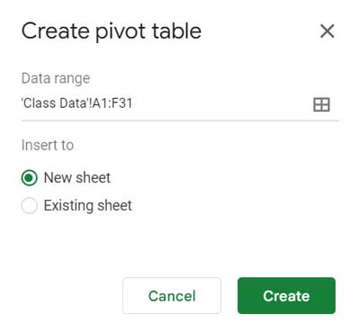
Step 1
Go to Insert > Pivot Table > New Sheet > Create.
What’s the “Existing sheet” option, then?
If you prefer that, Sheet will prompt you with an option to select a cell in any of your existing tabs in the file to create the Pivot Table report.
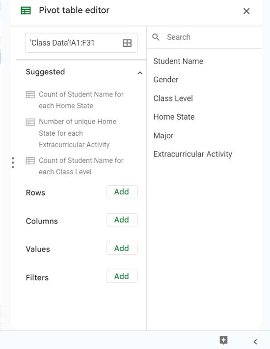
This action will open a blank sheet with a “Pivot table editor” panel where you can add the above two column labels to summarize data.
Step 2
Now add row and column fields from the Pivot table editor.
Remember! We are summarizing the data to find the number of Senior, Junior, etc., students for different subjects. So we should show the Subjects in rows.
“Major” is the relevant field containing the data in the sample Spreadsheet.
Click “Add” against “Rows” and choose “Major” from the field list. Instead, you can drag the field label major from the field list on the right-hand side of the editor panel and drop it under Rows.
Similarly, click “Add field” against “Columns” and choose “Class Level.” Class Level contains the data of Junior, Freshmen, Senior, etc.
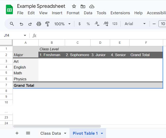
The unfinished Pivot Table Report will now look like this.
Step 3
Time to use some logic. What do we want to achieve? The hierarchy (grade) distribution in each subject, right?
That means we want to know how many seniors, juniors, etc. are in the college for each subject.
The column label for this purpose is the above same “Class Level,” which we have added against “Columns.”
Add this label again in “Pivot table editor,” but this time against “Values.” You can “Add” it or drag and drop it as earlier.
We need to get the count of the Seniors, juniors, etc. So use the function COUNTA under “Summarize by.” We should use COUNTA, not COUNT, as the “Class Level” column contains text values.
Now see the finished Pivot Table Sample Report in Google Sheets below.

Don’t misunderstand that the whole procedure is complicated. It only takes 2-3 minutes to complete all these steps to summarize data using Pivot Table in Google Sheets.
You must first understand what output you are expecting from your data. That is important.
Creating Advanced Pivot Table Reports in Google Sheets
You have learned how to create a Pivot Table in Google Sheets. What about mastering some advanced techniques in it? Here are some advanced-level tutorials.
Duration-Based
- Month Wise Pivot Table Report in Google Sheets Using Date Column.
- Group Dates in Pivot Table in Google Sheets (Month, Quarter, and Year).
- Rolling 7, 30, and 60 Days in Pivot Table in Google Sheets.
- Create an Age Analysis Report Using Google Sheet Pivot Table.
- Drill Down in Pivot Table in Google Sheets (Date Field).
Sorting Pivot Table
- How to Sort Pivot Table Grand Total Columns in Google Sheets.
- How to Sort Pivot Table Columns in the Custom Order in Google Sheets.
- How to Sort Pivot Table Rows, Not by the First Column in Google Sheets.
Filtering Pivot Table
- How to Filter Top 10 Items in Google Sheets Pivot Table.
- Filter Multiple Values in Pivot Table in Google Sheets.
- Filter the Top 3 Values in Each Group in Pivot Table – Google Sheets.
Other Tips
Hey, this was a really helpful tutorial, so thanks for writing it! Now I know how to make pivot tables in Google Spreadsheets!
Thank you for letting me know that you liked it! The Pivot Table is an extremely useful tool for spreadsheet users, saving us a lot of time.