


")


In this tutorial, we’ll go through the simple steps of creating a Line chart in Google Sheets—a useful tool for visualizing data.
A Line chart proves valuable for comparing multiple continuous data sets, making it ideal for illustrating changes over time. The chart comprises horizontal (x) and vertical (y) axes, connecting a series of data points with lines.
Below, I provide detailed steps to guide you through the creation of a Line graph in Google Sheets. For the purpose of this demonstration, let’s consider a sample cricket match score.
I will illustrate the creation of a Line chart depicting the progress of a 50-over-limited cricket match (one-day cricket match). You don’t need specific knowledge about the match; simply use the sample data provided.
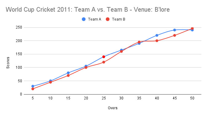
In the cricket match, Teams A and B competed, and their progress—positioned at every five overs—is depicted in the ensuing graph.
To begin, open a new sheet by clicking https://sheets.new/ and input the sample data provided below in the range B2:D12.
| Overs | Team A | Team B |
| 5 | 30 | 20 |
| 10 | 50 | 45 |
| 15 | 80 | 70 |
| 20 | 105 | 100 |
| 25 | 140 | 120 |
| 30 | 165 | 160 |
| 35 | 190 | 195 |
| 40 | 220 | 200 |
| 45 | 240 | 220 |
| 50 | 240 | 246 |
The first column contains the X-axis labels, and the subsequent columns represent Series A and B. This is the structure, although you have the flexibility to use one or more series.
Steps to Create a Line Chart in Google Sheets
There are two ways to create a Line chart: starting by selecting the chart source range or without selecting the chart source range. We’ll begin with the former option, which is quicker and easier.
Creating a Line Chart Directly from the Source Data
- First, select the data under “Overs” by choosing cells B2:B12. From the “Format” menu, select “Number,” and then choose “Plain Text.”
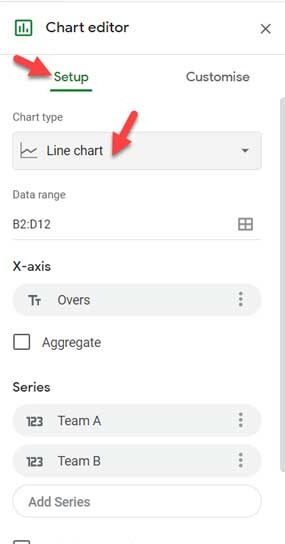
- Next, select the entire data range B2:D12. Go to the “Insert” menu and click on “Chart.” This action will promptly open the Chart Editor panel (dialog box) with a default graph.
- Click on the tab labeled “Setup.”
- Under “Chart type,” select either “Line chart” or “Smooth line chart.”
Following these steps, you can successfully create a Line graph in Google Sheets.
How to Manually Enter Series and X-axis for a Line Chart in Google Sheets?
You can create a Line chart with or without selecting the source data. In the example provided above, we pre-selected the data. If you haven’t done so, follow the steps below.
- Click on any blank cell, for instance, cell F2.
- Go to Insert > Chart.
- Under the “Setup” tab, choose “Line chart.”
- In the “Data range” field, replace F2 with B2:D12.
The X-axis and series will be added automatically because our data is already structured. If not, follow these additional steps.
- Click “Add X-axis” and select “Overs.”
- Click “Add Series” and choose “Team A.” Similarly add “Team B.”
By following these steps, you can manually enter the series and X-axis for your Line chart in Google Sheets.
Customization (Optional)
Customizing a Line chart is remarkably straightforward, and you can achieve this by exploring the options under the chart editor’s “Customize” tab. Here are the essential customizations:
- Opening the Chart Editor Panel:
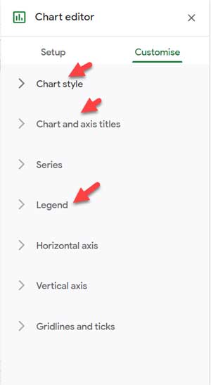
If the chart editor panel is closed, double-click on the chart to open it, and then click on the “Customize” tab. - Adding a Title:
- Click on ‘Chart and axis titles’ > ‘Chart title.’
- Provide a title; for example, I’m using “World Cup Cricket 2011: Team A vs. Team B – Venue: B’lore.”
- Labeling Axes:
- For the horizontal axis (representing overs), go to ‘Chart and axis titles’ > ‘Horizontal axis title’ and label it as “Overs.”
- For the vertical axis, navigate to ‘Chart and axis titles’ > ‘Vertical axis title’ and label it as “Scores.”
- Legend Placement:
- Determine the legend position by clicking on ‘Legend.’ I suggest placing it at the bottom, so set it accordingly.
- Chart Style:
- Click on “Chart style” and optionally choose or toggle the “Smooth” feature.
- Final Touches:
- You’re almost done creating your first Line chart/graph in Google Sheets. If desired, you can further customize elements like background color, grid lines, data points, etc., directly from the Chart Editor panel.
Review the completed sample chart below for reference.
Conclusion
I have covered all the essential steps for creating a Line chart in Google Sheets.
After successfully creating your chart, you can access additional options by clicking on the three vertical dots menu on the chart. This menu allows you to edit, delete, move to its own sheet, copy the chart, and more.
To activate this menu, simply click on the chart and explore these options.
Additionally, you can experiment with dynamically controlling chart source data by using drop-downs. This enables you to include or exclude series in charts by clicking on series names in the drop-downs. For more tips and tricks, explore additional tutorials available.
- How to Get Dynamic Range in Charts in Google Sheets.
- How to Use Slicer in Google Sheets to Filter Charts and Tables.
- Add Legend Next to Series in Line or Column Chart in Google Sheets.
- How to Change Data Point Colors in Charts in Google Sheets.
- How to Move the Vertical Axis to the Right Side in Google Sheets Chart.
[…] Docs chart from spreadsheet – basic tutorial, use charts in […]
[…] Link : How to Create a Line Chart or Line Graph in Google Doc Spreadsheet […]
[…] we have learned how to create a Line Graph or Line Chart using Google Doc Spreadsheet. In this Google Doc tutorial we are explaining how to […]