


Create a bar chart in Google Sheets to visualize categorical data with horizontal bars, whose lengths are proportional to the values they represent.
Before creating a chart in Google Sheets or any other application, it is important to understand the data you want to visualize and choose the appropriate chart type.
Bar charts, line charts, and pie charts are the three most popular chart types. They are easy to create and understand, and they serve different purposes.
Bar charts are used to compare different categories of data. Line charts are used to show trends over time. Pie charts are used to show the parts of a whole.
You can create a bar chart and line chart from the same set of data in most cases, but a line chart is better suited for showing continuous progress, while a bar chart is better suited for comparing categories.
People often confuse bar charts and column charts. In a bar chart, the bars are aligned horizontally, whereas in a column chart, the bars are aligned vertically.
How to Create a Bar Chart in Google Sheets: Tips and Tricks
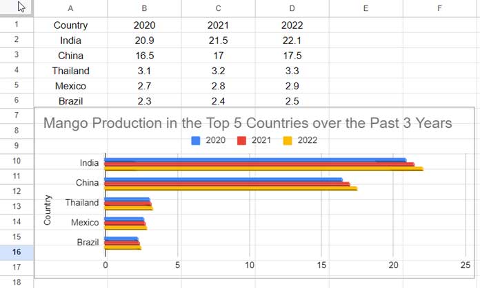
We can use the sample data in the below table with mango production in 5 countries in 2020, 2021, and 2022 in million metric tonnes for the chart.
Please present the data in the following format, where the first column should contain the category (Y-axis) and the subsequent columns the values to compare (series):
| Country | 2020 | 2021 | 2022 |
| India | 20.9 | 21.5 | 22.1 |
| China | 16.5 | 17 | 17.5 |
| Thailand | 3.1 | 3.2 | 3.3 |
| Mexico | 2.7 | 2.8 | 2.9 |
| Brazil | 2.3 | 2.4 | 2.5 |
This format is better suited for creating a bar chart in Google Sheets. Otherwise, you would have to select the Y-axis and then the series independently.
If you present the data as above, the first column will be used to label the bars on the Y-axis, and the subsequent columns will be used to plot the values for each year.
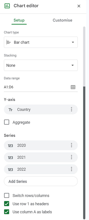
Assuming the above range is A1:D6, to create a horizontal bar chart in Google Sheets with this data, follow these steps:
- Select the data range A1:D6, including the header row.
- Click Insert > Chart.
- In the Chart editor on the right, select Bar chart from the Chart type drop-down menu.
Note: The chart settings will look like the image below.
Your chart will be ready, and you can compare the three years of mango production in India, China, Thailand, Mexico, and Brazil.
Click Customize to customize the chart. There are several options that you can experiment with. Here are the essential chart customizations for a bar chart in Google Sheets:
Essential Bar Chart Customizations
- In the Chart editor, click the Customize tab.
- Click Chart and axis titles and click to select Chart title.
- Under the Chart title, enter the title you want. For example, “Mango Production in the Top 5 Countries over the Past 3 Years”.
- Under Chart style, click 3D.
- If you want a transparent background, under Chart style, set the background color to None.
This will create a simple but effective 3D bar chart. You can further customize the chart by changing the bar colors, axis labels, and other settings.
How to Filter a Bar Chart in Google Sheets
We have learned to create a bar chart in Google Sheets. What about filtering it?
When you want to focus on a few of the categories in a bar chart, you can filter out the others. This way, you can easily compare the remaining categories.
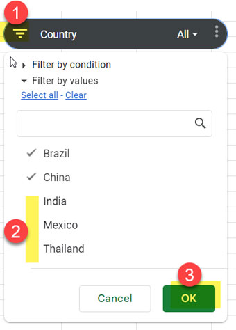
For example, let’s see how to filter out the countries Thailand, Mexico, and Brazil and just compare mango production in India and China.
The best option is to use a slicer.
To add a slicer to control the bar chart categories, follow these steps:
- Select the range that you used to create the bar chart, in this case, A1:D6.
- Click Data > Add a slicer.
- In the Slicer dialog box (sidebar panel), click the Choose a column drop-down menu and select Country.
- Click the filter button on the slicer and uncheck the unwanted categories, in this case, Thailand, Mexico, and Brazil.
- Click OK.
This will filter the bar chart to only show the data for India and China.
Conclusion
We can summarize the steps to create a bar chart in Google Sheets as follows:
- Present the data in the correct format:
- The first column should contain the categories (Y-axis labels).
- The subsequent columns should contain the values to compare (Series).
- Select the data and click Insert > Chart.
- The keyboard shortcut for this step is Alt + i + h in Windows and Ctrl + Option + i + h in Mac.
- Select the “Bar chart” chart type.
- Add a slicer if you want to filter the categories.
Related: Basic GANTT Chart in Google Sheets Using Stacked Bar Chart.