


")


 for the Gantt Chart: one for the bars and the other for highlighting the weekends.)
We can effortlessly create a Gantt Chart in Google Sheets by employing a few formulas: two for highlighting and additional formulas for timescale and duration.
I have previously published tutorials on chart preparation in Google Sheets. These tutorials encompassed various chart types, including combination charts, line graphs, bar charts, progress curves, and more. You can locate these tutorials in the CHARTS menu on the navigation bar above.
Now, let’s delve into a straightforward approach to creating a Gantt Chart using formulas and conditional formatting in Google Sheets.
Introduction
Gantt Charts, named after Henry L. Gantt, share visual similarities with bar charts, but their intended use differs.
These charts find extensive application in preparing project schedules, representing each activity with a designated work start and end date through visual bars on the Gantt Chart.
Various applications are available for Gantt Chart creation, including some options that may involve costs for individual use.
In my professional experience, I have utilized MS Project and Primavera, both known for their flexibility in calculating factors such as man-hours and costs. However, mastering these applications might necessitate some training.
Alternatively, you can create a functional Gantt Chart in Google Sheets without spending a single penny.
If you’re interested in crafting a straightforward Gantt Chart for your project, follow the tutorial below. We will guide you through the process of preparing a Gantt Chart using formulas in Google Sheets, Google’s spreadsheet application.
How to Create a Gantt Chart Using Formulas in Google Sheets
This involves mainly three parts: preparing the layout (formatting), applying formulas, and then implementing highlight rules.
We will begin with layout preparation. I have included the free template in the last part of this tutorial.
Layout Preparation
We need to list a few tasks along with their start and end dates, which are crucial for creating a Gantt Chart. Let’s get started by entering this information.
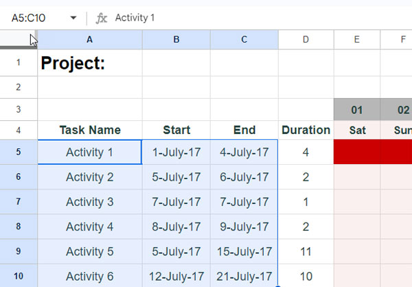
- Enter the task names in cells A5:A.
- Input the tasks’ start and end dates in cells B5:B and C5:C, respectively.
- Remove the remaining rows at the bottom. To remove:
- Click on the first row you want to delete.
- Press the Shift + Down arrow key to select the rows you want to delete.
- Right-click on any of the selected rows.
- Choose “Delete rows” from the context menu.
We will add more rows, if necessary, after applying all the formulas and conditional format rules. Then only they will inherit the formatting from the rows above. For more details about this feature, refer to my tutorial here: How to Create Self-Formatting Tables in Google Sheets (With a Simple Initial Setup).
Formulas for Timescale, Days of the Week, Duration, and Label
Here are the formulas (4 nos.) that we will use within cells, not within conditional formatting rules. Although you can manually enter dates in the timescale and calculate the duration, these formulas simplify those tasks.
Here are the formulas and their roles in creating the Gantt Chart in Google Sheets.
Duration (Formula #1):
In cell D5, use the following formula to calculate the duration of each task in D5:D.
=ArrayFormula(IF(A5:A="", ,C5:C-B5:B+1))This formula checks if A5:A is blank. If true, it returns an empty string; otherwise, it calculates the duration by subtracting the start date from the end date and adding 1.
Timescale (Formula #2):
To generate the timescale, enter the following formula in cell E3, covering the range E3:3.
=SEQUENCE(1, MAX(C5:C)-MIN(B5:B)+2, MIN(B5:B))Then, select the range E3:3, navigate to Format > Number > Custom number format, and input dd to format the date.
What does this formula do?
The SEQUENCE function returns values in 1 row and MAX(C5:C)-MIN(B5:B)+2 (representing the project start date to the project end date, plus 2 additional columns) columns, starting the sequence from MIN(B5:B) (the project start date).
Days of the Week (Formula #3):
In cell E4, input the following formula to display the days of the week.
=ArrayFormula(TEXT(SEQUENCE(1, MAX(C5:C)-MIN(B5:B)+2, MIN(B5:B)), "DDD"))This formula utilizes the SEQUENCE function within the TEXT function to return the days of the week.
Now, delete all blank columns, if any, at the end of the third row. Select the first blank column, press the Shift + Right arrow key, right-click on the selection, and choose “Delete columns” from the context menu.
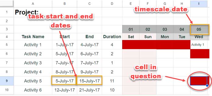
Labelling Task Names at the End of the Bar (Formula #4):
If you wish to have task names appear at the end of the bar, insert the following formula in cell E5.
=ArrayFormula(if(E3:3=C5:C+1, A5:A,))This formula checks if the timescale date is equal to the task end date + 1. If true, it returns the corresponding task name from A5:A.
We have covered all the formulas for creating the Gantt Chart in Google Sheets. The remaining components are the highlight rules.
Highlight Rules (Formulas) for the Gantt Chart
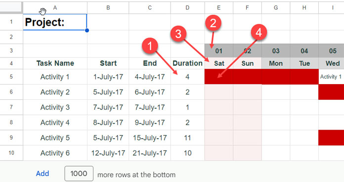
We will employ two highlight rules (formulas) for the Gantt Chart: one for the bars and the other for highlighting the weekends.
Gantt Chart Formula for Highlighting the Bars:
Use the following formula within conditional formatting to accurately create the bars:
=AND($B5<>"", E$3>=$B5, E$3<=$C5)Please follow the below steps to insert this formula:
- Select the entire bar area (e.g., E5:Z10).
- Go to Format > Conditional Formatting.
- Under Format rules, select Custom formula is.
- Paste the formula:
=AND($B5<>"", E$3>=$B5, E$3<=$C5) - Click Done.
Formula Explanation:
Conditional formatting operates based on the principles of absolute and relative references. We can make rows, columns, or both relative or absolute in the highlight rule formula by inserting dollar symbols. The above Gantt Chart bar highlight rule (formula) serves as an example of this concept and works as follows:
In the rule-applied range, i.e., E5:Z10, in each cell, the formula will adjust as follows:
- E$3 (timescale start date) will become F$3, G$3, H$3, and so on in columns, with no changes in rows.
- $B5 and $C5 (first task start and end dates) become $B6 and $C6, $B7 and $C7, $B8 and $C8, and so on in rows, with no changes in columns.
Condition:
The formula highlights a cell if the timescale date in the current column falls between the start and end dates for the task in the current row, and the task’s start date in the current row is not blank. Please see the screenshot below:
Highlighting Weekends Based on the Timescale:
Once again, click on Format > Conditional formatting. On the sidebar panel, click “Add another rule.”
Paste the following rule:
=AND(ISDATE(E$3), OR(WEEKDAY(E$3)=1, WEEKDAY(E$3)=7))This formula checks if the value in the current cell corresponding to the timescale is a valid date, and if the weekday number of that date is 1 or 7 (Sunday or Saturday). If it evaluates to TRUE, the formula highlights that cell.
Free Gantt Chart Template and Additional Resources
Above, I’ve explained how to easily create a Gantt Chart using a few formulas in Google Sheets. This will possibly meet your basic scheduling requirements.
Here is the template that we used for the explanation purposes above.
Additional Resources:
- Basic GANTT Chart in Google Sheets Using Stacked Bar Chart
- Create a Gantt Chart Using Sparkline in Google Sheets
- Split a Task in a Custom Gantt Chart in Google Sheets
- Multi-Color Gantt Chart in Google Sheets
- Days Remaining in Gantt Chart in Google Sheets
- Date Filter in Gantt Chart in Google Sheets
- GANTT_CHART Function in Google Sheets (Named Function)
Hi, Love this! So helpful.
Quick question. I set up formula 2, and it works great.
However, the labels are getting cut off in each cell and aren’t overflowing into subsequent cells to make the task labels legible, even though I have all the cells set to overflow.
I don’t want to have the text wrap because it will make the rows too tall. Any ideas?
Hi, Kendra,
Thanks for pointing out the issue.
I have updated my post to replace formula # 2 with a new array formula. Please find that in the last part of the tutorial.
HI! I am currently having a problem with the formula I copied for conditional format. Is it possible to reflect the color tab based on the latest date of the task? Instead of my tasks are viewed in vertical (column cell) data, I combine the task into a 1 row then my start date and end dates are transposed horizontally. When I encode the same date, the color tab was not reflected.
Hi, Niara,
Sample sheet, please.
Great sheet – working well for me.
I was wondering if there is a way to have different stages of a task in one row if each stage had its own start and end dates?
So engineer A works on Project B and that project has 5 stages – can I show those stages as different colors on the same row?
Hi, James,
I am not sure the type of data that you have. If I could see that, I may be able to answer.
Hello, thanks for this. I encountered an error doing as you have mentioned though. I inserted Formula #1 into the conditional formatting however it highlighted the bottom rows instead, and the dates I wanted to highlight (between start and end dates) were not highlighted. does anyone encounter this issue?
Hi, Aisyah,
You may please check my example sheet (link is given within the post).
Is there a way to have the rows in 2 different colors?
We have two types of projects that we want to show on the same timeline but call them out. We have a column that indicates what type but wasn’t sure if this was possible.
Hi, Lindsay,
That’s possible if you can mark the projects in another column. For example, insert a column after D.
In that inserted column, i.e. column E, type the project names to differentiate the projects.
For example, I am typing “project 1” in the first few rows in that column and “project 2” in the rest of the rows in that column (in the range E5:E15). Then use the below formulas in Conditional formatting to plot two different color bars in Gantt Chart.
Custom Rule 1: Blue Color
=and(E$3>=$B5,E$3<=$C5,$E4="project 1")Custom Rule 2: Orange Color
=and(E$3>=$B5,E$3<=$C5,$E4="project 2")Best,
To replicate this with a WEEKLY schedule (where the cells contain the week # or week start day instead of individual days). I use the following formula. The start/stop days can still be entered as days.
I used the following formula instead:
=and(weeknum(I$1-1)>=weeknum($D2-1),weeknum(I$1-1)<=weeknum($F2-1))Note: my formula has a modification. The week # starts on Sunday but I added "-1" to start on Monday instead.
I’m loving this template.
I was wondering if I could make another column for only deadlines? So there are no start and end dates, it is just one date that I would like to reflect on the calendar.
Hi, Bianca Frasson,
Insert a new column after D for ‘deadlines’. So the new bar area will be F5:Z15.
Select this range and insert the below formula in “Conditional formatting” as custom formula rule.
=and(E$3=$E5)After inserting this move this rule (by pointing on the left side of the rule and click on the 3 vertical dots to drag) above the existing one.
The color of both rules must be different.
Hey!
Indeed your template is great, I’ve tried several before and none this easy to replicate. Thank you!
Thanks for leaving your feedback!
Hi this chart is working really well. Is there a way to have it display without the weekends?
Thanks,
Matt
Hi, Matt,
To avoid highlight weekends, change the custom rule as below.
=and(E$3>=$B5,E$3<=$C5, weekday(E$3)<>7,weekday(E$3)<>1)Best,