


")


How to Create a Weekly or Monthly Progress Chart (a Combo Chart) in Google Sheets:
Google Sheets can assist you with chart suggestions, enabling you to create a suitable chart within minutes. It suggests a chart by analyzing your selected data, which can aid in creating an appropriate chart. However, it may not work in every case.
For instance, when you aim to craft a powerful weekly or monthly progress chart, a certain level of customization is required. A weekly or monthly progress chart typically involves a combination of line and bar charts, and there may be a need for a secondary axis.
In this tutorial, I’ll guide you through creating a progress chart in Google Sheets in what is arguably the simplest way.
Why Should One Use a Progress Chart to Track Job Progress?
There must be a well-planned job schedule to successfully complete a job. However, having a schedule alone is not sufficient. What’s next?
It is crucial to strictly monitor the progress and make necessary adjustments as needed. Various methods can be employed to assess the progress of a scheduled job. Charts are particularly effective in visually assessing the progress of a scheduled job.
This comprehensive tutorial covers every aspect of creating a progress chart report in Google Sheets. While the focus is on creating a progress chart report, the tutorial will also provide in-depth insights into various aspects of creating charts in Google Sheets.
What Will You Learn by Creating This Progress Chart in Google Sheets?
- How to Create a Chart in Google Sheets.
- Creating Combo (Combination) Charts in Google Sheets: This involves combining a line chart and a column chart.
- How to Add a Secondary Axis (Secondary Y-axis) in Google Sheets: Also known as the “Right Axis.”
- How to Create an S Curve in Google Docs Spreadsheet: The term “S” curve is commonly used in job schedules. When drawing a line chart with the cumulative schedule or progress values, it often resembles an “S” shape. This is because the job progresses, and the schedule reflects a slow start, growth acceleration, and a subsequent plateau.
- How to Create a Monthly Progress Report in Google Sheets: This method can be applied to daily, monthly, or weekly progress reports in the same way.
Why Are We Using a Combo Chart Here?
There is a specific reason:
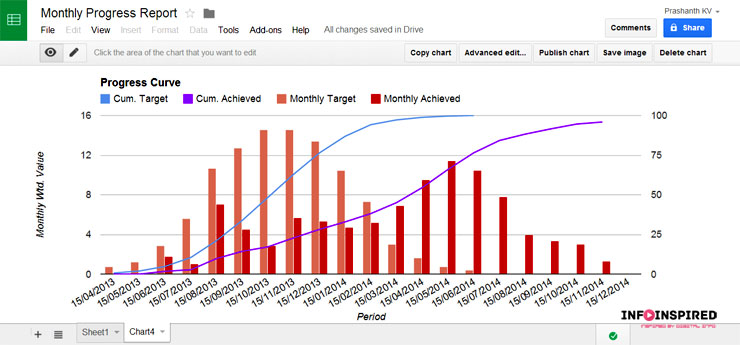
We want to display both the monthly schedule and progress, as well as the cumulative schedule and progress.
We will use column charts to illustrate the monthly schedule and progress.
For the cumulative schedule and progress, we will use line charts.
Why Are We Using Secondary Axis Here?
We want to visualize the monthly and cumulative data, which we can’t do without using two axes.
Monthly Data:
- Schedule – left axis.
- Progress – left axis.
Cumulative Data:
- Schedule – right axis.
- Progress – right axis.
Please refer to the finished chart view above before going through the steps to create a progress chart in Google Sheets.
Steps to Create a Weekly or Monthly Progress Chart in Google Sheets
Type the sample data shown below into a blank Google Sheets file. To save you time, I am leaving my sample sheet here. Feel free to make a copy.
The sheet’s name is ‘Monthly Progress.’
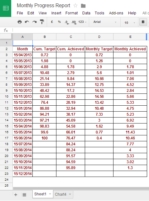
There are two running sum array formulas in cells B3 and C3 that use column D and E values.
To create a monthly progress chart in Google Sheets, we need monthly targets (schedule in column D) and monthly achieved (data in column E).
If you have a weekly schedule, enter the corresponding data in columns D and E. The formulas will take care of the cumulative columns.
Column A should contain months (date or text) or weeks (date or text), accordingly.
Steps
First, select the entire data range from cell A2 to E23.
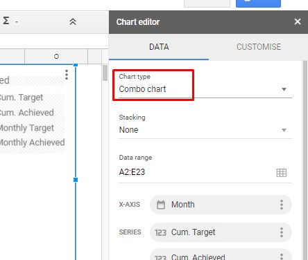
Click on Insert > Chart.
On the Chart editor that appears on the right-hand side, select Chart type > Combo chart.
Then click on the chart, and from the drop-down menu, select “Move to own sheet” (optional).
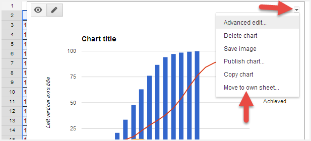
The chart will be moved to a new sheet. Now, we can easily edit it without any distractions.
The next step is to add the respective series to the secondary axis or ‘Right Axis.’
We will move “Cum. Target” and “Cum. Achieved” to the secondary/right axis.
First, we will change the series type and move the required series to the secondary or Right Axis.
How to Change Series Type in Google Sheets Chart?
The default series may not meet our requirements, and you may need to change the Line chart to a Column or vice versa.
To change the series types in a Google Sheets chart, follow the instructions below.
First, double-click anywhere on the blank space on the chart to activate the Chart editor. Under the Customize tab, click the ‘Series’ drop-down.
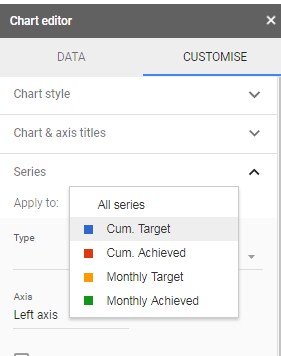
Refer to the above image to change the series type from line to column or column to line in Google Docs Spreadsheets.
Select the series and change the type.
In other words, “Cum. Target” and “Cum. Achieved” should be of the type “Line,” while “Monthly Target” and “Monthly Achieved” should be of the type “Columns.”
Then, we should move “Cum. Target” and “Cum. Achieved” to the secondary axis, meaning the ‘Right Axis.’
We are one step closer to creating a powerful weekly or monthly progress chart in Google Sheets.
How to Move Series to Secondary (Right) Axis in Google Sheets Charts?
First, select the series “Cum. Achieved”. Then, at the bottom, you can find the option to move the selected series to the right. See the image below.
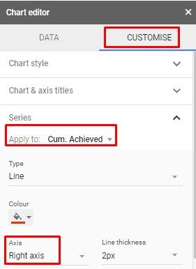
Repeat the same for ‘Cum. Target’. Now, change the chart title and axis names, etc., from the customization tab.
That’s it. You have just completed creating your monthly progress chart in Google Sheets.
Conclusion
Follow the above steps to create daily, weekly, and monthly progress charts or curves in Google Sheets.
The chart presented above is the one that I used for many years during my tenure with one of my employers (I had worked in the Planning department for many years) that specialized in EPC. However, the sample data above is just mocked.
For any clarification, please feel free to post in the comments below.
Related Charts:
- Create a GANTT Chart in Google Sheets Using a Stacked Bar Chart.
- Create Gantt Chart Using Formulas in Google Spreadsheet.
- How to Create a Site Organisation Chart in Google Sheets.
- How to Add Tooltips to Org Chart in Google Sheets.
- Get a Target Line Across a Column Chart in Google Sheets.
- How to Move the Vertical Axis to the Right Side in Google Sheets Chart.
- Bar or Column Chart with Red Colors for Negative Bars in Google Sheets.
- Add Legend Next to Series in Line or Column Chart in Google Sheets.
- How to Use Slicer in Google Sheets to Filter Charts and Tables.
- Scorecard Charts in Google Sheets – All that You Want to Know.
I hope this isn’t a dumb question, but where do the formulas come from?
I know that they are derived from the points on an S-curve but that’s what I am trying to figure out, those points but for varying schedule durations.
What if I have a 3-year project? What if I have a six-month project?
Thanks for any help.
Hi Jerry Seitzinger,
I have just edited the post to include my sample sheet that contains the progress chart and the data used. Find that sheet link under “Steps to Create a Weekly or Monthly Progress Chart in Google Sheets.”
The formulas are in cell ‘Monthly Progress’!B3 and ‘Monthly Progress’!C3.
As far as I know, normally, when we plot a (construction) job project schedule (EPC), it will take the form of an ‘S’ curve (job peak at the starting and ending of the project).
“What if I have a 3-year project? What if I have a six-month project?”
I assume you already have a job schedule. Regardless of whether it is weekly, fortnightly, or monthly, enter it in column D. Record the progress in column E.
Check my sheet to understand it.
This was helpful, thank you. However, how can I create a graph with stacked columns and a goal line?
-M